Designing UNHCR Branded Charts using unhcrthemes
Source:vignettes/articles/design-unhcr-charts.Rmd
design-unhcr-charts.RmdData visualization is a powerful tool for conveying information and insights from complex datasets. The United Nations High Commissioner for Refugees (UNHCR) provides crucial refugee statistics that can be presented in an informative and visually appealing manner. The unhcrthemes package, in combination with the refugees package and the versatile ggplot2 library, offers an excellent solution to create UNHCR-branded charts with ease.
Setup
Before we start creating UNHCR branded charts, make sure you have the necessary packages installed:
# Install CRAN packages
packages <- c("refugees", "tidyverse", "scales", "ragg", "pak")
install.packages(setdiff(packages, rownames(installed.packages())))

# Install unhcrthemes with pak
pak::pkg_install("unhcr-dataviz/unhcrthemes")
Load the packages into your R environment:
Some packages installed above will be loaded using the
:: notation to make the code and intentions clearer.
For this tutorial, we’ll use statistics provided by UNHCR. The refugee package allows us to access and work with this data. You can find more information on the datasets available and the use of the refugees package in this blog post.
# Set caption for all charts, as we will only use the refugees package
caption <- "Source: Refugee Data Finder<br>© UNHCR, The UN Refugee Agency"
Bar chart
Single bar chart
Let’s start by creating a simple bar chart to visualize the top 10 refugee and other people in need of international protection by country of origin in 2022.
Preparing the data:
# Keep only 2022 records, Sum refugees and oip,
# Keep only top 10, Wrap long label
bar_df <- refugees::population |>
  filter(year == 2022) |>
  summarise(
    refugees = sum(refugees, na.rm = TRUE) + sum(oip, na.rm = TRUE),
    .by = coo_name
  ) |>
  slice_max(order_by = refugees, n = 10) |>
  mutate(coo_name = str_wrap(coo_name, 25))
Plot:
# Set title and subtitle
title_bar <- "Refugees and other people in need of international protection"
subtitle_bar <- "By country of origin at the end of 2022"

# Plot
ggplot(
  bar_df,
  aes(
    x = refugees,
    y = reorder(coo_name, refugees)
  )
) +
  geom_col(
    fill = unhcr_pal(n = 1, "pal_blue"),
    width = 0.8
  ) +
  scale_x_continuous(
    expand = expansion(mult = c(0, .1)),
    breaks = seq(0, 7e6, by = 1e6),
    labels = scales::label_number(scale_cut = scales::cut_short_scale())
  ) +
  labs(
    title = title_bar,
    subtitle = subtitle_bar,
    caption = caption,
    x = "Number of people"
  ) +
  theme_unhcr(grid = "X", axis = "Y", axis_title = "X")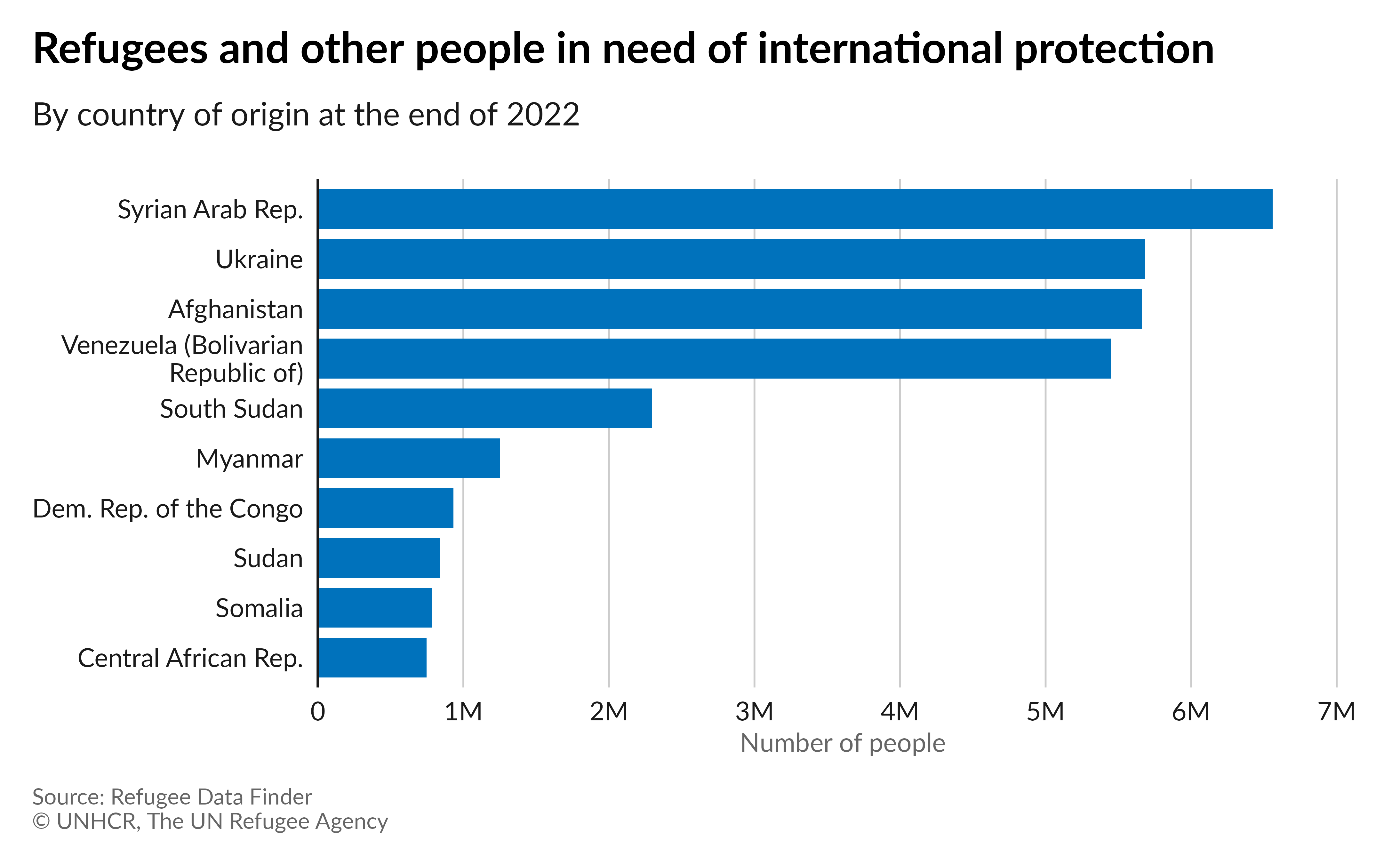
Plot with labels:
# Plot with labels
ggplot(
  bar_df,
  aes(
    x = refugees,
    y = reorder(coo_name, refugees)
  )
) +
  geom_col(
    fill = unhcr_pal(n = 1, "pal_blue"),
    width = 0.8
  ) +
  geom_text(
    aes(
      label = scales::label_number(
        scale_cut = scales::cut_si(unit = ""),
        accuracy = .1
      )(refugees)
    ),
    hjust = -.2
  ) +
  scale_x_continuous(expand = expansion(mult = c(0, .1))) +
  labs(
    title = title_bar,
    subtitle = subtitle_bar,
    caption = caption
  ) +
  theme_unhcr(grid = FALSE, axis = "Y", axis_text = "Y", axis_title = FALSE)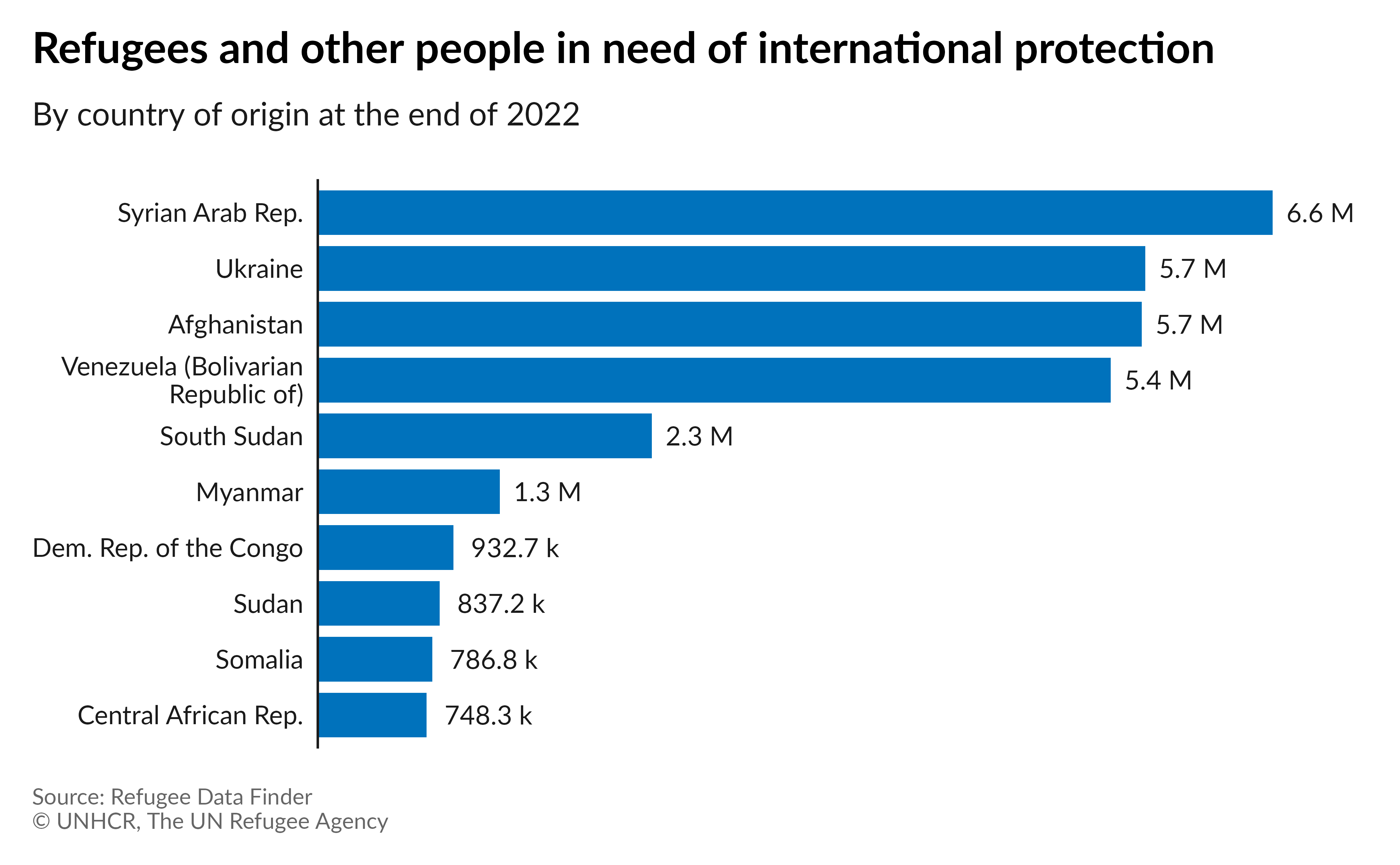
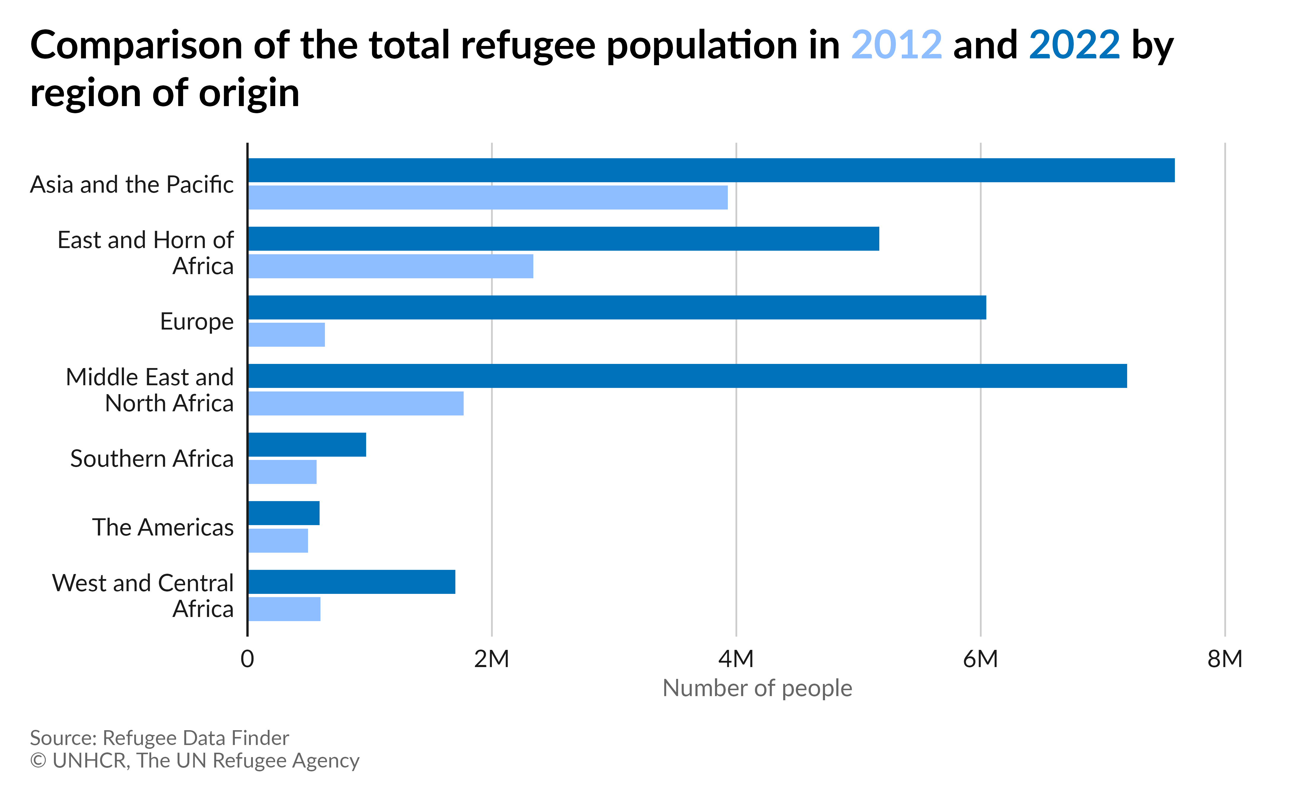
Grouped bar chart
Let’s compare the refugee population originating in each UNHCR region for both 2012 and 2022. We will use a grouped bar chart.
Preparing the data:
# Keep 2012 and 2022 records, Load and join region names,
# Group by year and region and sum refugees,
# Wrap long label, Remove NA
group_bar_df <- refugees::population |>
  filter(year == 2012 | year == 2022) |>
  left_join(refugees::countries, by = c("coo_iso" = "iso_code")) |>
  group_by(year, unhcr_region) |>
  summarise(refugees = sum(refugees, na.rm = TRUE)) |>
  mutate(unhcr_region = str_wrap(unhcr_region, 20)) |>
  filter(!is.na(unhcr_region))
Plot:
# Set title and subtitle
title_group_bar <- paste0(
  "Comparison of the total refugee population in <span style='color:",
  unhcr_pal(n = 1, "pal_cyan")[1],
  "'>2012</span> and <span style='color:",
  unhcr_pal(n = 1, "pal_blue")[1],
  "'>2022</span> by region of origin"
)

# Plot
ggplot(
  group_bar_df,
  aes(
    x = refugees,
    y = fct_rev(as_factor(unhcr_region)),
    fill = as_factor(year)
  )
) +
  geom_col(
    width = .7,
    position = position_dodge(.8),
  ) +
  scale_x_continuous(
    expand = expansion(mult = c(0, .1)),
    labels = scales::label_number(scale_cut = scales::cut_short_scale())
  ) +
  scale_fill_unhcr_d(nmax = 4, order = c(4, 1)) +
  labs(
    title = title_group_bar,
    caption = caption,
    x = "Number of people"
  ) +
  theme_unhcr(
    grid = "X", axis = "Y", axis_title = "X",
    legend = FALSE
  )
Plot with labels:
# Plot with labels
ggplot(
  group_bar_df,
  aes(
    x = refugees,
    y = fct_rev(as_factor(unhcr_region)),
    fill = as_factor(year)
  )
) +
  geom_col(
    width = .7,
    position = position_dodge(.8),
  ) +
  geom_text(
    aes(
      label = scales::label_number(
        scale_cut = scales::cut_si(unit = ""),
        accuracy = .1
      )(refugees)
    ),
    position = position_dodge(.8),
    hjust = -.2
  ) +
  scale_x_continuous(expand = expansion(mult = c(0, .1))) +
  scale_fill_unhcr_d(nmax = 4, order = c(4, 1)) +
  labs(
    title = title_group_bar,
    caption = caption,
  ) +
  theme_unhcr(
    grid = FALSE, axis = "Y", axis_title = FALSE,
    axis_text = "Y", legend = FALSE
  )
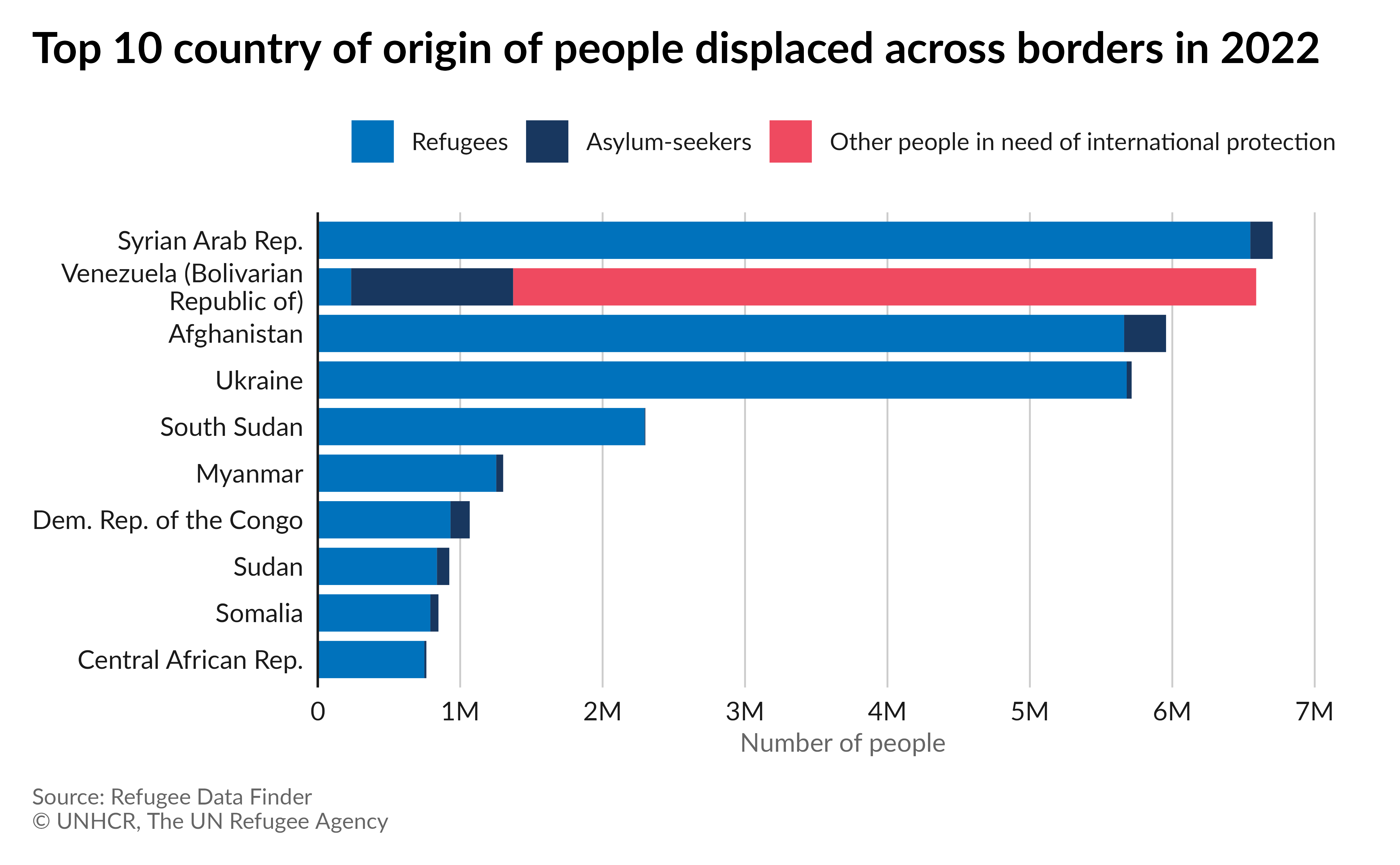
Stacked bar chart
Let’s make a stacked bar chart comparing the top 10 countries of origin for all people displaced across borders, by type, in 2022.
Preparing the data:
# Keep only 2022 records, Summarize popolutaion type by coo,
# Keep only top 10, Pivot for ggplot2,
# Wrap long label and make factor of pop_type, Remove 0
stack_bar_df <- refugees::population |>
  filter(year == 2022) |>
  summarise(
    ref = sum(refugees, na.rm = TRUE),
    oip = sum(oip, na.rm = TRUE),
    asy = sum(asylum_seekers, na.rm = TRUE),
    tot = ref + oip + asy,
    .by = coo_name
  ) |>
  slice_max(order_by = tot, n = 10) |>
  pivot_longer(
    cols = c(ref, oip, asy),
    names_to = "pop_type",
    values_to = "pop_num"
  ) |>
  mutate(
    coo_name = str_wrap(coo_name, 25),
    pop_type = factor(pop_type, levels = c("oip", "asy", "ref"))
  ) |>
  select(-tot) |>
  filter(pop_num != 0)
Plot:
# Set title and subtitle
title_stack_bar <- "Top 10 country of origin of people displaced across borders in 2022"

# Plot
ggplot(
  stack_bar_df,
  aes(
    x = pop_num,
    y = fct_rev(as_factor(coo_name)),
    fill = pop_type
  )
) +
  geom_col(
    width = 0.8
  ) +
  scale_x_continuous(
    expand = expansion(mult = c(0, .1)),
    breaks = seq(0, 7e6, by = 1e6),
    labels = scales::label_number(scale_cut = scales::cut_short_scale())
  ) +
  scale_fill_unhcr_d(
    palette = "pal_unhcr_poc", nmax = 6,
    order = c(6, 2, 1), labels = c("Other people in need of international protection", "Asylum-seekers", "Refugees"),
    guide = guide_legend(reverse = TRUE)
  ) +
  labs(
    title = title_stack_bar,
    caption = caption,
    x = "Number of people"
  ) +
  theme_unhcr(
    grid = "X", axis = "Y", axis_title = "X",
    legend_text_size = 9
  )
Plot with labels:
# Add subtitle instead of legend
subtitle_stack_bar <- paste0(
  "People displaced across borders asr composed of <span style='color:",
  unhcr_pal(n = 6, "pal_unhcr_poc")[1],
  "'>Refugees</span>, <span style='color:",
  unhcr_pal(n = 6, "pal_unhcr_poc")[2],
  "'>Asylum-seekers</span> and <span style='color:",
  unhcr_pal(n = 6, "pal_unhcr_poc")[6],
  "'>Other people in need of international protection</span>."
)

# Plot with labels
ggplot(
  stack_bar_df,
  aes(
    x = pop_num,
    y = fct_rev(as_factor(coo_name)),
    fill = pop_type,
    group = pop_type
  )
) +
  geom_col(width = 0.8) +
  geom_text(
    aes(
      label = case_when(
        pop_num >= 1e6 ~ scales::label_number(
          scale_cut = scales::cut_si(unit = ""),
          accuracy = .1
        )(pop_num),
        TRUE ~ scales::label_number(
          scale_cut = scales::cut_si(unit = ""),
          accuracy = 1
        )(pop_num)
      ),
      hjust = case_when(
        pop_num < 2e5 & pop_type == "asy" ~ -0.25,
        pop_num < 5e5 & pop_type == "asy" ~ -0.55,
        pop_num < 5e5 & pop_type == "ref" ~ 0.15,
        TRUE ~ .5
      ),
      color = case_when(
        pop_num < 5e5 & pop_type == "asy" ~ "#1a1a1a",
        TRUE ~ "#ffffff"
      )
    ),
    position = position_stack(vjust = .5),
    size = 9 / .pt
  ) +
  scale_x_continuous(
    expand = expansion(mult = c(0, .1))
  ) +
  scale_fill_unhcr_d(
    palette = "pal_unhcr_poc", nmax = 6,
    order = c(6, 2, 1)
  ) +
  scale_color_identity() +
  labs(
    title = title_stack_bar,
    subtitle = subtitle_stack_bar,
    caption = caption
  ) +
  theme_unhcr(
    grid = FALSE, axis = "Y", axis_title = FALSE,
    axis_text = "y", legend = FALSE
  )
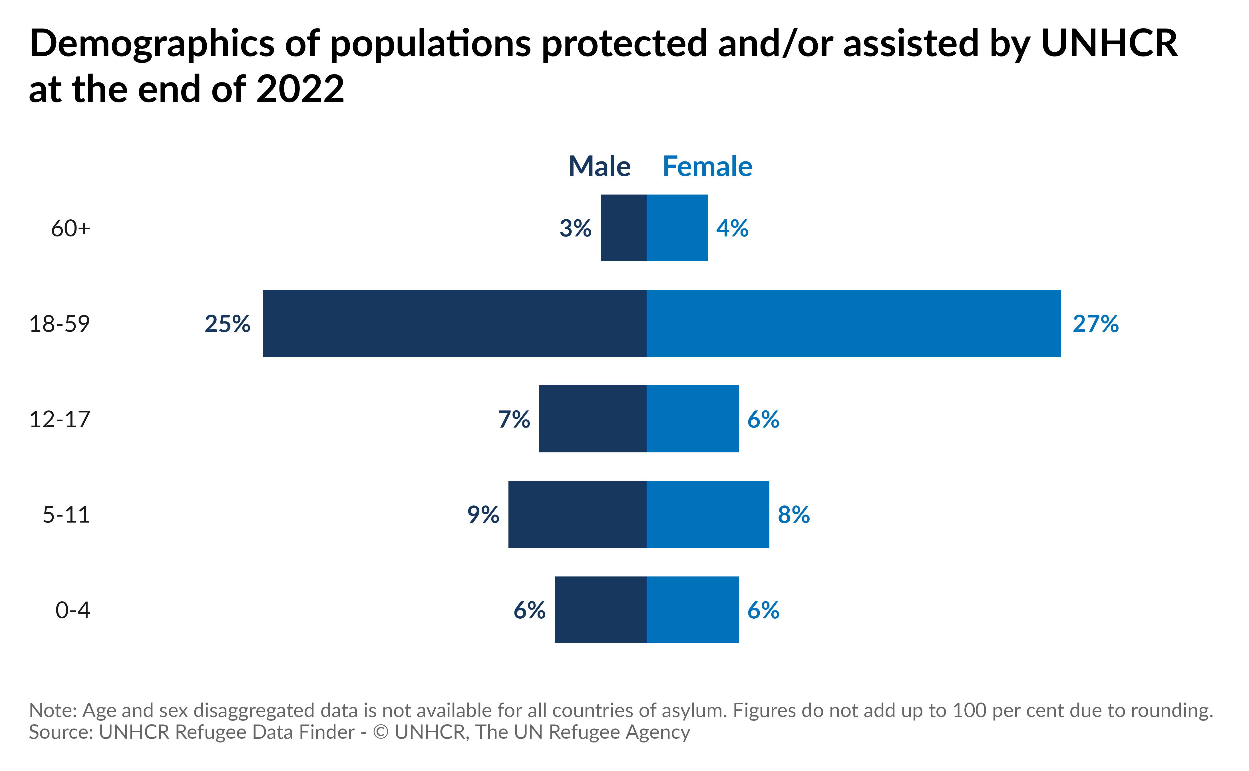
Population pyramid
This type of chart is perfect to represent age & gender disagregation. Let’s make a population pyramid of populations protected and/or assisted by UNHCR in 2022.
Preparing the data:
# Filter 2022 records, Keep only relevant pop_type,
# Summarise age group, pivot and separate age/gender,
# Calculate percent, put ages in a factor
pyramid_df <- refugees::demographics |>
  filter(year == 2022 &
    pop_type %in% c("REF", "ASY", "IDP", "OIP", "RDP", "RET", "STA", "OOC")) |>
  summarise(
    "male 0-4" = sum(m_0_4, na.rm = TRUE),
    "male 5-11" = sum(m_5_11, na.rm = TRUE),
    "male 12-17" = sum(m_12_17, na.rm = TRUE),
    "male 18-59" = sum(m_18_59, na.rm = TRUE),
    "male 60+" = sum(m_60, na.rm = TRUE),
    "female 0-4" = sum(f_0_4, na.rm = TRUE),
    "female 5-11" = sum(f_5_11, na.rm = TRUE),
    "female 12-17" = sum(f_12_17, na.rm = TRUE),
    "female 18-59" = sum(f_18_59, na.rm = TRUE),
    "female 60+" = sum(f_60, na.rm = TRUE)
  ) |>
  pivot_longer(
    cols = everything(),
    names_sep = " ",
    names_to = c(".value", "ages")
  ) |>
  mutate(
    male_p = round(male / (sum(female) + sum(male)), 2),
    female_p = round(female / (sum(female) + sum(male)), 2),
    ages = factor(ages, levels = c("0-4", "5-11", "12-17", "18-59", "60+"))
  )
Plot:
# Plot
ggplot(
  pyramid_df,
  aes(y = ages)
) +
  geom_col(aes(x = -male_p),
    fill = unhcr_pal(n = 1, "pal_blue"),
    width = .7
  ) +
  geom_col(aes(x = female_p),
    fill = unhcr_pal(n = 1, "pal_cyan"),
    width = .7
  ) +
  geom_text(
    aes(
      x = -male_p,
      label = scales::percent(abs(male_p))
    ),
    hjust = 1.25,
    color = unhcr_pal(n = 1, "pal_blue"),
    fontface = "bold"
  ) +
  geom_text(
    aes(
      x = female_p,
      label = scales::percent(abs(female_p))
    ),
    hjust = -.25,
    color = unhcr_pal(n = 4, "pal_cyan")[4],
    fontface = "bold"
  ) +
  scale_x_continuous(expand = expansion(c(0.2, 0.2))) +
  coord_cartesian(clip = "off") +
  labs(
    title = "Demographics of populations protected and/or assisted by UNHCR at the end of 2022",
    caption = "Note: Age and sex disaggregated data is not available for all countries of asylum. Figures do not add up to 100 per cent due to rounding.<br>Source: UNHCR Refugee Data Finder - © UNHCR, The UN Refugee Agency"
  ) +
  annotate("text", x = -.01, y = 5.65, label = "Male", size = 12 / .pt, family = "Lato", fontface = "bold", hjust = 1, color = unhcr_pal(n = 1, "pal_blue")) +
  annotate("text", x = .01, y = 5.65, label = "Female", size = 12 / .pt, family = "Lato", fontface = "bold", hjust = 0, color = unhcr_pal(n = 4, "pal_cyan")[4]) +
  theme_unhcr(
    axis_text = "Y", axis_title = FALSE, grid = FALSE,
    plot_title_margin = 24
  )
Column chart
Single column chart
A column chart is quite similar to a bar chart, but the bars are vertical. Let’s make a column chart of the last 10 years of total refugee population.
Preparing the data:
# Keep only 2013-2022 records, Sum refugees, Make year factor
column_df <- refugees::population |>
  filter(year >= 2013 & year <= 2022) |>
  summarise(
    refugees = sum(refugees, na.rm = TRUE),
    .by = year
  ) |>
  mutate(year = as_factor(year))
Plot:
# Set title
title_column <- "Total number of refugees | 2013-2022"

# Plot
ggplot(
  column_df,
  aes(x = year, y = refugees)
) +
  geom_col(
    fill = unhcr_pal(n = 1, "pal_blue"),
    width = 0.8
  ) +
  scale_y_continuous(
    expand = expansion(mult = c(0, .1)),
    breaks = seq(0, 30e6, by = 5e6),
    labels = scales::label_number(scale_cut = scales::cut_short_scale())
  ) +
  labs(
    title = title_column,
    caption = caption,
    Y = "Number of people"
  ) +
  theme_unhcr(grid = "Y", axis = "X", axis_title = FALSE)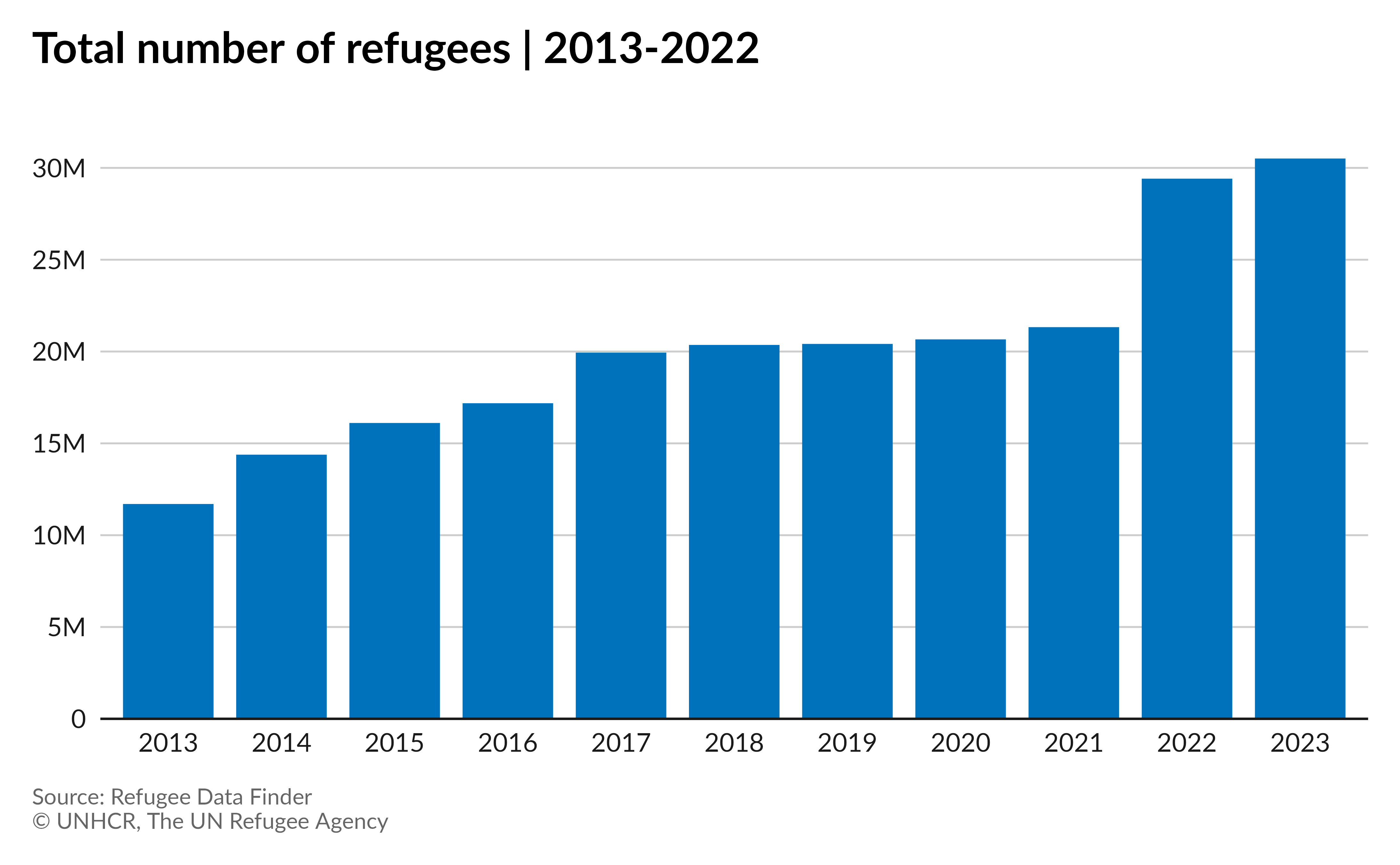
Plot with labels:
# Plot with labels
ggplot(
  column_df,
  aes(x = year, y = refugees)
) +
  geom_col(
    fill = unhcr_pal(n = 1, "pal_blue"),
    width = 0.8
  ) +
  geom_text(
    aes(
      label = scales::label_number(
        scale_cut = scales::cut_short_scale(),
        accuracy = .1
      )(refugees)
    ),
    vjust = -.4
  ) +
  scale_y_continuous(
    expand = expansion(mult = c(0, .1)),
    breaks = seq(0, 30e6, by = 5e6),
    labels = scales::label_number(scale_cut = scales::cut_short_scale())
  ) +
  labs(
    title = title_column,
    caption = caption,
    Y = "Number of people"
  ) +
  theme_unhcr(grid = FALSE, axis = "X", axis_title = FALSE, axis_text = "X")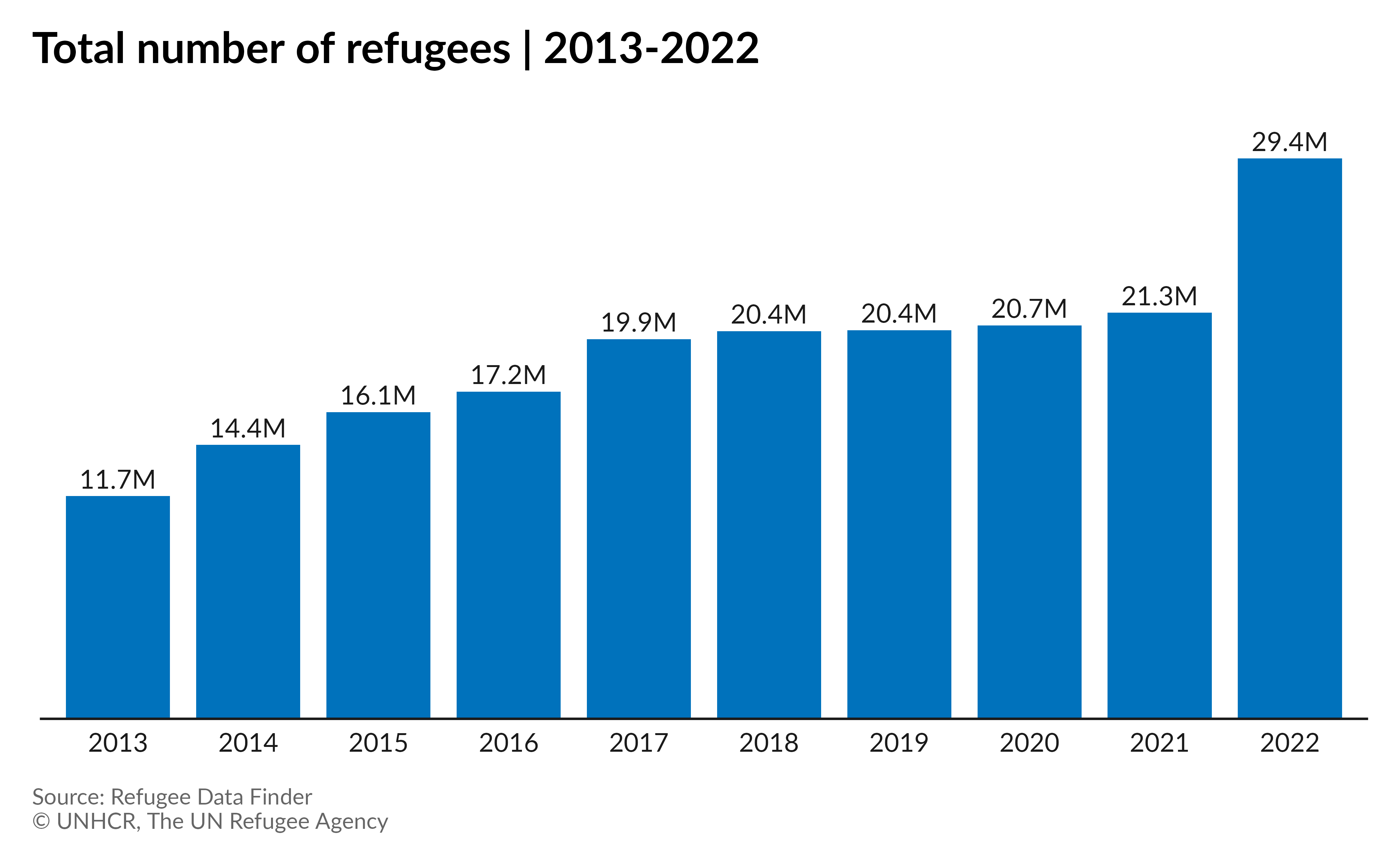
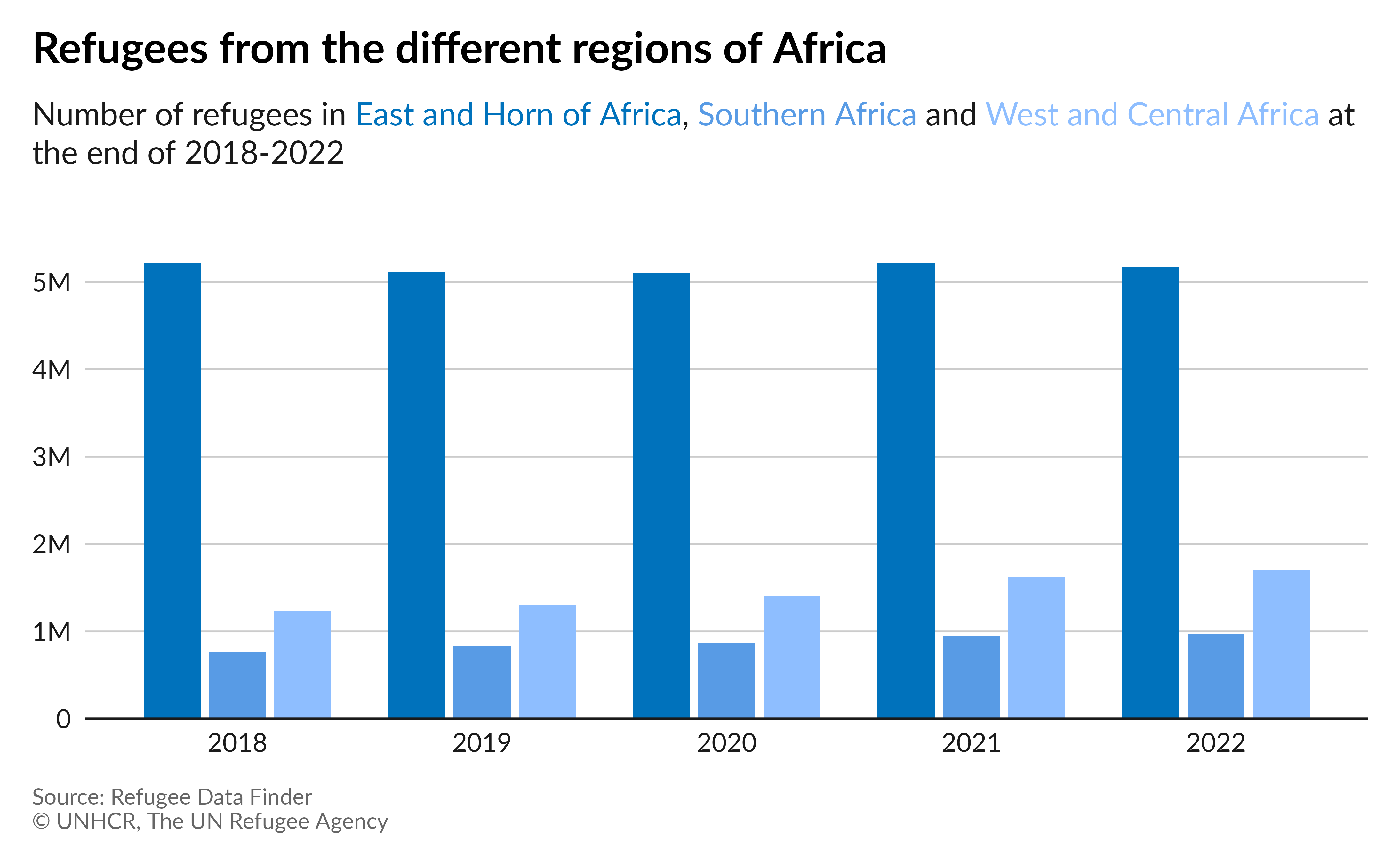
Grouped column chart
Let’s compare the 2018-2022 refugee population, originating in the three UNHCR regions in Africa. We will use a grouped column chart.
Preparing the data:
# Keep 2018-2022 records, Load and join region names,
# Group by year and region and sum refugees,
# Keep only regions in Africa
group_col_df <- refugees::population |>
  filter(year >= 2018 & year <= 2022) |>
  left_join(refugees::countries, by = c("coo_iso" = "iso_code")) |>
  group_by(year, unhcr_region) |>
  summarise(refugees = sum(refugees, na.rm = TRUE)) |>
  ungroup() |>
  filter(unhcr_region %in% c(
    "East and Horn of Africa",
    "Southern Africa",
    "West and Central Africa"
  ))
Plot:
# Set title
region_name <- group_col_df |>
  distinct(unhcr_region) |>
  pull(unhcr_region)

title_group_col <- "Refugees from the different regions of Africa"

subtitle_group_col <- paste0(
  "Number of refugees in <span style='color:",
  unhcr_pal(n = 3, "pal_unhcr")[1], "'>",
  region_name[1], "</span>, <span style='color:",
  unhcr_pal(n = 3, "pal_unhcr")[2], "'>",
  region_name[2], "</span> and <span style='color:",
  unhcr_pal(n = 3, "pal_unhcr")[3], "'>",
  region_name[3], "</span> at the end of 2018-2022"
)

# Plot
ggplot(
  group_col_df,
  aes(
    x = year,
    y = refugees,
    fill = unhcr_region
  )
) +
  geom_col(
    width = .7,
    position = position_dodge(.8),
  ) +
  scale_y_continuous(
    expand = expansion(mult = c(0, .1)),
    labels = scales::label_number(scale_cut = scales::cut_short_scale())
  ) +
  scale_fill_unhcr_d(
    palette = "pal_unhcr", nmax = 3
  ) +
  labs(
    title = title_group_col,
    subtitle = subtitle_group_col,
    caption = caption,
    x = "Number of people"
  ) +
  theme_unhcr(
    grid = "Y", axis = "X", axis_title = FALSE,
    legend = FALSE
  )
Plot with labels:
# Plot with labels
ggplot(
  group_col_df,
  aes(
    x = year,
    y = refugees,
    fill = unhcr_region
  )
) +
  geom_col(
    width = .7,
    position = position_dodge(.8),
  ) +
  geom_text(
    aes(
      label = scales::label_number(
        scale = .000001,
        accuracy = .1,
        suffix = "M"
      )(refugees)
    ),
    position = position_dodge(.8),
    vjust = -.3
  ) +
  scale_y_continuous(
    expand = expansion(mult = c(0, .1))
  ) +
  scale_fill_unhcr_d(
    palette = "pal_unhcr", nmax = 3
  ) +
  labs(
    title = title_group_col,
    subtitle = subtitle_group_col,
    caption = caption,
    x = "Number of people"
  ) +
  theme_unhcr(
    grid = FALSE, axis_text = "x", axis = "X",
    axis_title = FALSE, legend = FALSE
  )
Stacked column chart
Let’s plot the forcibly displaced people by type of population from 2013 to 2022.
Preparing the data:
# UNHCR data: Keep 2013-2022 records, pivot longer pop_type,
# Summarise by year and pop_type, drop 0s, rename pop_type
unhcr_df <- refugees::population |>
  filter(year >= 2013 & year <= 2022) |>
  pivot_longer(
    cols = c(refugees, oip, asylum_seekers),
    names_to = "pop_type",
    values_to = "pop_num"
  ) |>
  summarise(pop_num = sum(pop_num, na.rm = TRUE), .by = c(year, pop_type)) |>
  filter(pop_num != 0)

# IDMC data: Keep 2013-2022 records,
# Summarise by year, create pop_type
idmc_df <- refugees::idmc |>
  filter(year >= 2013 & year <= 2022) |>
  summarise(pop_num = sum(total, na.rm = TRUE), .by = year) |>
  mutate(pop_type = "idmc")

# UNRWA data: Keep 2013-2022 records,
# Summarise by year, create pop_type
unrwa_df <- refugees::unrwa |>
  filter(year >= 2013 & year <= 2022) |>
  summarise(pop_num = sum(total, na.rm = TRUE), .by = year) |>
  mutate(pop_type = "unrwa")

# Append dataframes together, level factor pop_type, make year factor
stack_col_df <- bind_rows(unhcr_df, idmc_df, unrwa_df) |>
  mutate(
    pop_type = factor(pop_type, levels = c(
      "idmc",
      "refugees",
      "unrwa",
      "oip",
      "asylum_seekers"
    )),
    year = as_factor(year)
  )
Plot:
# Set title
stack_col_title <- "People forced to flee worldwide | 2013-2022"

# Plot
ggplot(
  stack_col_df,
  aes(
    x = year,
    y = pop_num,
    fill = pop_type
  )
) +
  geom_col(
    width = .7,
    position = position_stack(reverse = TRUE)
  ) +
  scale_y_continuous(
    expand = expansion(mult = c(0, 0)),
    labels = scales::label_number(scale_cut = scales::cut_short_scale()),
    breaks = scales::pretty_breaks(n = 5)
  ) +
  scale_fill_unhcr_d(
    palette = "pal_unhcr_poc", nmax = 6,
    order = c(3, 1, 5, 6, 2),
    labels = c(
      "IDPs",
      "Refugees under\nUNHCR's mandate",
      "Refugees under\nUNRWA's mandate",
      "Other people in need\nof international protection",
      "Asylum-seekers"
    )
  ) +
  labs(
    title = stack_col_title,
    caption = caption,
  ) +
  theme_unhcr(
    grid = "Y", axis = "X", axis_title = FALSE,
    legend_text_size = 9
  ) +
  guides(fill = guide_legend(ncol = 3))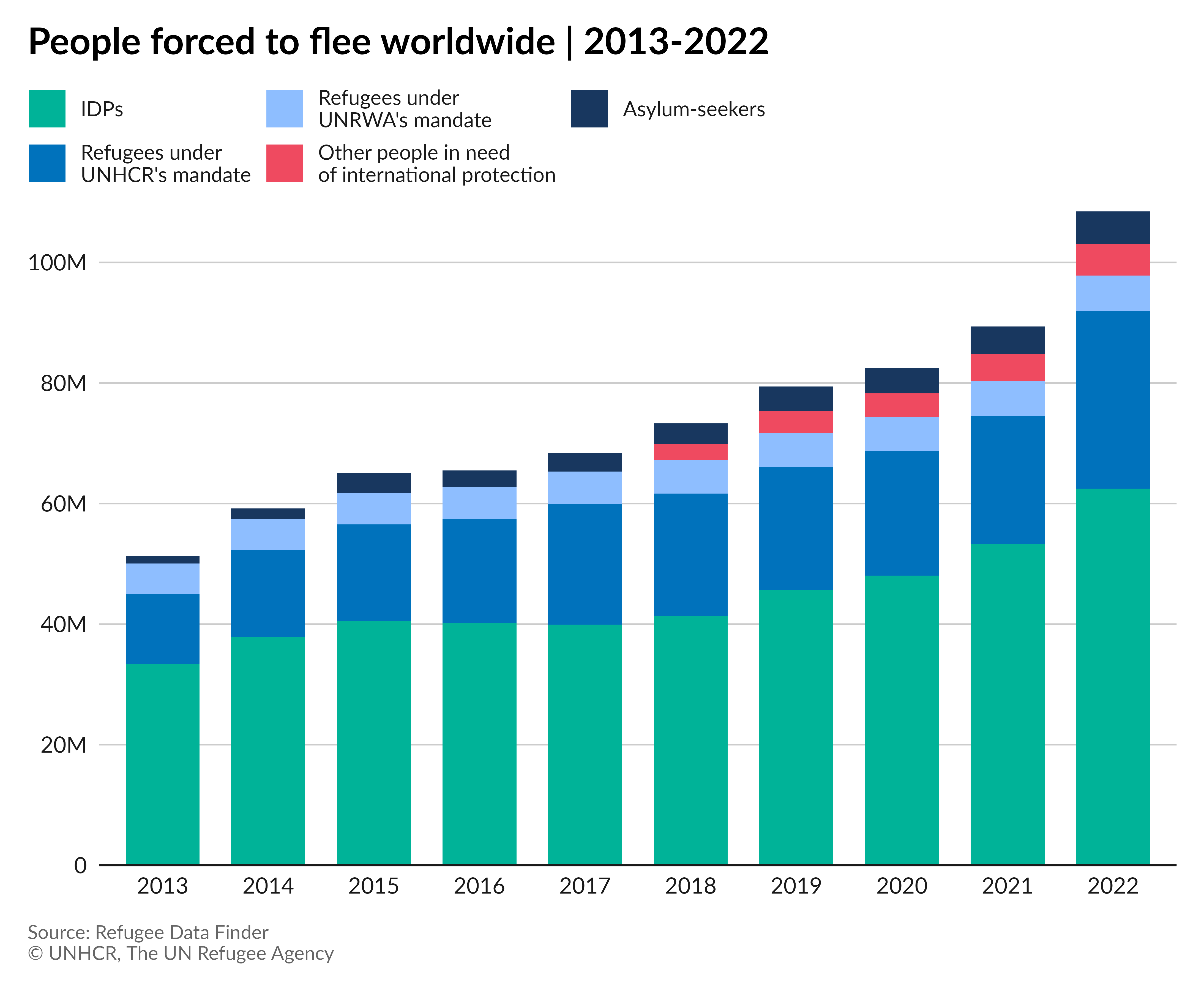
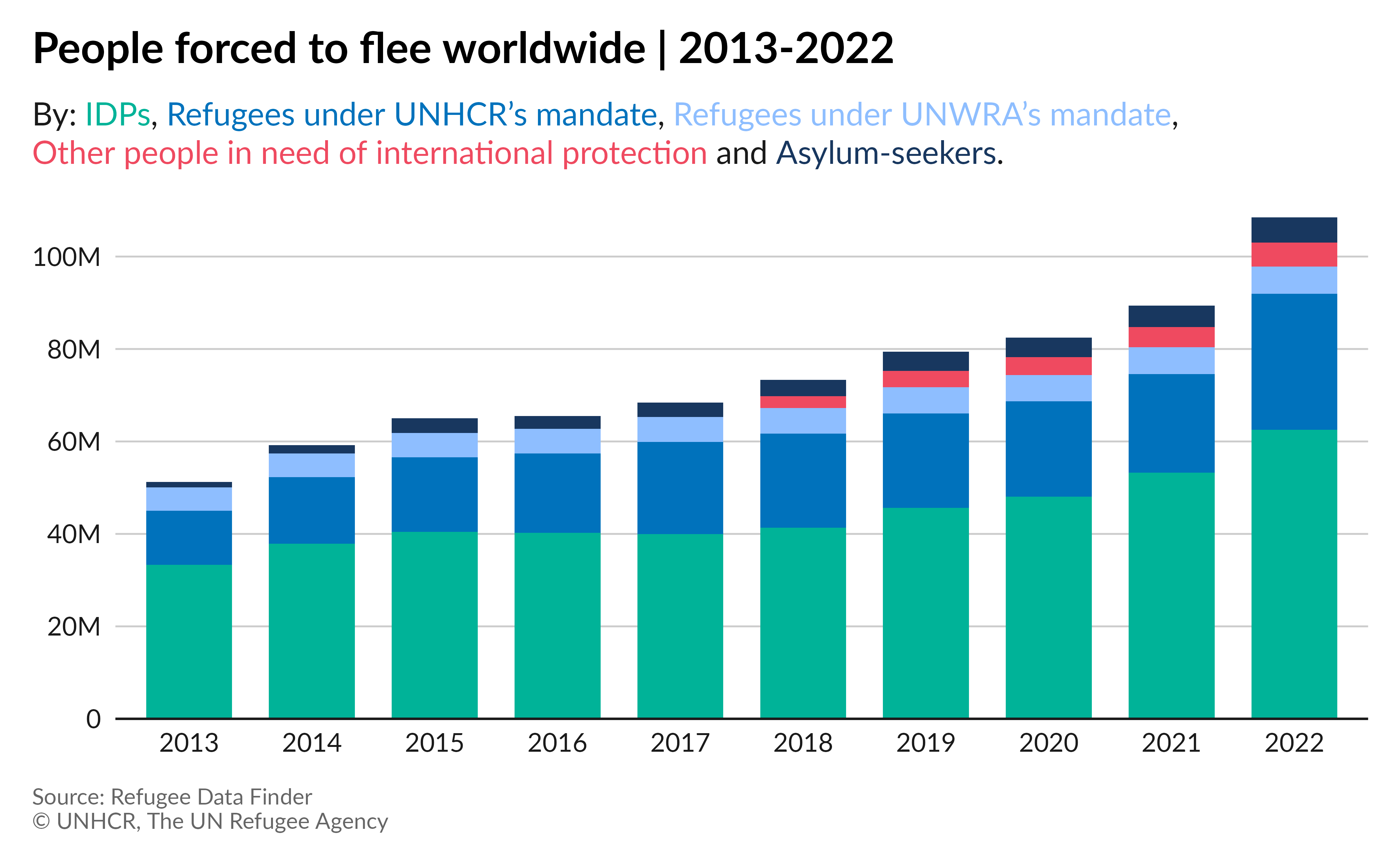
Plot with category in subtitle:
# Set subtitle
stack_col_subtitle <- paste0(
  "By: <span style='color:",
  unhcr_pal(n = 6, "pal_unhcr_poc")[3],
  "'>IDPs</span>, <span style='color:",
  unhcr_pal(n = 6, "pal_unhcr_poc")[1],
  "'>Refugees under UNHCR's mandate</span>, <span style='color:",
  unhcr_pal(n = 6, "pal_unhcr_poc")[5],
  "'>Refugees under UNWRA's mandate</span>,<br><span style='color:",
  unhcr_pal(n = 6, "pal_unhcr_poc")[6],
  "'>Other people in need of international protection</span> and <span style='color:",
  unhcr_pal(n = 6, "pal_unhcr_poc")[2],
  "'>Asylum-seekers</span>."
)


# Plot with labels
ggplot(
  stack_col_df,
  aes(
    x = year,
    y = pop_num,
    fill = pop_type
  )
) +
  geom_col(
    width = .7,
    position = position_stack(reverse = TRUE)
  ) +
  scale_y_continuous(
    expand = expansion(mult = c(0, 0)),
    labels = scales::label_number(scale_cut = scales::cut_short_scale()),
    breaks = scales::pretty_breaks(n = 5)
  ) +
  scale_fill_unhcr_d(
    palette = "pal_unhcr_poc", nmax = 6,
    order = c(3, 1, 5, 6, 2)
  ) +
  labs(
    title = stack_col_title,
    subtitle = stack_col_subtitle,
    caption = caption,
  ) +
  theme_unhcr(
    grid = "Y", axis = "X", axis_title = FALSE, legend = FALSE
  )
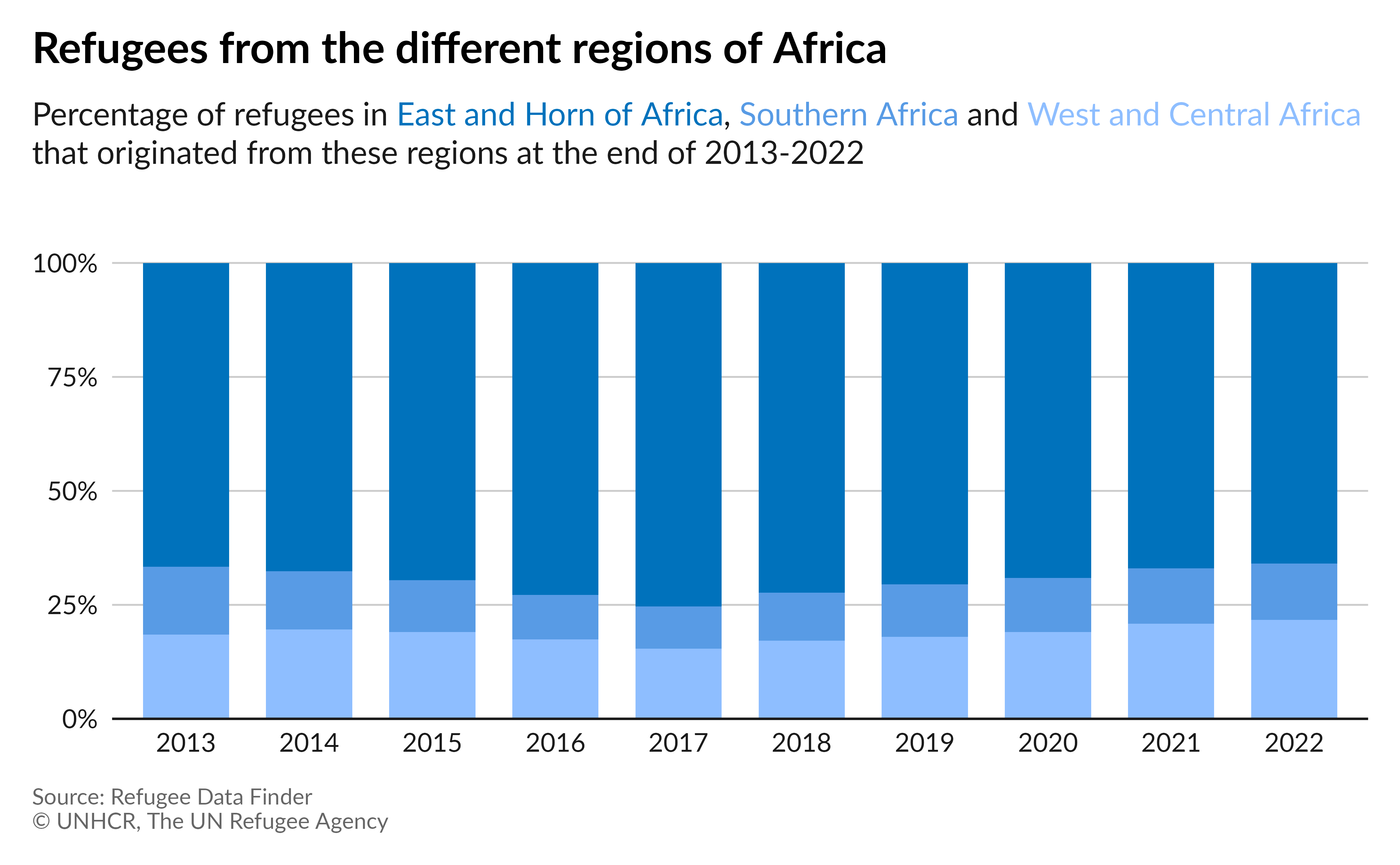
100% stacked column chart
Let’s create a 100% stacked column chart showing the total refugee population for the last 10 years, by the each of the three UNHCR regions in Africa.
Preparing the data:
# Keep 2013-2022 records, Load and join region names,
# Keep only regions in Africa, Group by year and region and sum refugees,
# Group by year and calculate percent, make year as factor
percent_stack_df <- refugees::population |>
  filter(year >= 2013 & year <= 2022) |>
  left_join(refugees::countries, by = c("coo_iso" = "iso_code")) |>
  filter(unhcr_region %in% c(
    "East and Horn of Africa",
    "Southern Africa",
    "West and Central Africa"
  )) |>
  group_by(year, unhcr_region) |>
  summarise(refugees = sum(refugees, na.rm = TRUE)) |>
  ungroup() |>
  group_by(year) |>
  mutate(refugees = refugees / sum(refugees)) |>
  ungroup() |>
  mutate(year = as_factor(year))
Plot:
# Set title
region_name <- percent_stack_df |>
  distinct(unhcr_region) |>
  pull(unhcr_region)

title_percent_stack <- "Refugees from the different regions of Africa"

subtitle_percent_stack <- paste0(
  "Percentage of refugees in <span style='color:",
  unhcr_pal(n = 3, "pal_unhcr")[1], "'>",
  region_name[1], "</span>, <span style='color:",
  unhcr_pal(n = 3, "pal_unhcr")[2], "'>",
  region_name[2], "</span> and <span style='color:",
  unhcr_pal(n = 3, "pal_unhcr")[3], "'>",
  region_name[3], "</span> that originated from these regions at the end of 2013-2022"
)

# Plot
ggplot(
  percent_stack_df,
  aes(
    x = year,
    y = refugees,
    fill = unhcr_region
  )
) +
  geom_col(
    width = .7,
  ) +
  scale_y_continuous(
    expand = expansion(mult = c(0, .1)),
    labels = scales::label_percent()
  ) +
  scale_fill_unhcr_d(
    palette = "pal_unhcr", nmax = 3
  ) +
  labs(
    title = title_percent_stack,
    subtitle = subtitle_percent_stack,
    caption = caption
  ) +
  theme_unhcr(
    grid = "Y", axis = "X", axis_title = FALSE,
    legend = FALSE
  )
Plot with labels:
# Plot with labels
ggplot(
  percent_stack_df,
  aes(
    x = year,
    y = refugees,
    fill = unhcr_region
  )
) +
  geom_col(
    width = .7,
  ) +
  geom_text(
    aes(
      label = scales::label_percent(
        accuracy = .1
      )(refugees)
    ),
    hjust = .5,
    position = position_stack(vjust = .5),
    color = if_else(
      percent_stack_df$unhcr_region == "Southern Africa",
      "#1a1a1a",
      "#ffffff"
    )
  ) +
  scale_y_continuous(
    expand = expansion(mult = c(0, .1)),
    labels = scales::label_percent()
  ) +
  scale_fill_unhcr_d(
    palette = "pal_unhcr", nmax = 3
  ) +
  labs(
    title = title_percent_stack,
    subtitle = subtitle_percent_stack,
    caption = caption
  ) +
  theme_unhcr(
    grid = FALSE, axis = "X", axis_title = FALSE,
    axis_text = "x", legend = FALSE
  )
Line chart
Single line chart
Let’s plot the evolution of the total refugee population from 1993 to 2022.
Preparing the data:
# Keep data from 1993 to 2022,
# Sum refugees by year, year as factor
single_line_df <- refugees::population |>
  filter(year >= 1993 & year <= 2022) |>
  summarise(
    refugees = sum(refugees, na.rm = TRUE),
    .by = year
  ) |>
  mutate(year = as_factor(year))
Plot:
# Set title
title_single_line <- "Total number of refugees | 1993-2022"

# Plot
ggplot(
  single_line_df,
  aes(
    x = year,
    y = refugees,
    group = 1
  )
) +
  geom_line(
    color = unhcr_pal(n = 1, "pal_blue"),
    size = 1
  ) +
  scale_x_discrete(
    breaks = scales::pretty_breaks(n = 5)
  ) +
  scale_y_continuous(
    labels = scales::label_number(scale_cut = scales::cut_short_scale())
  ) +
  labs(
    title = title_single_line,
    caption = caption
  ) +
  theme_unhcr(grid = "Y", axis = "X", axis_title = FALSE)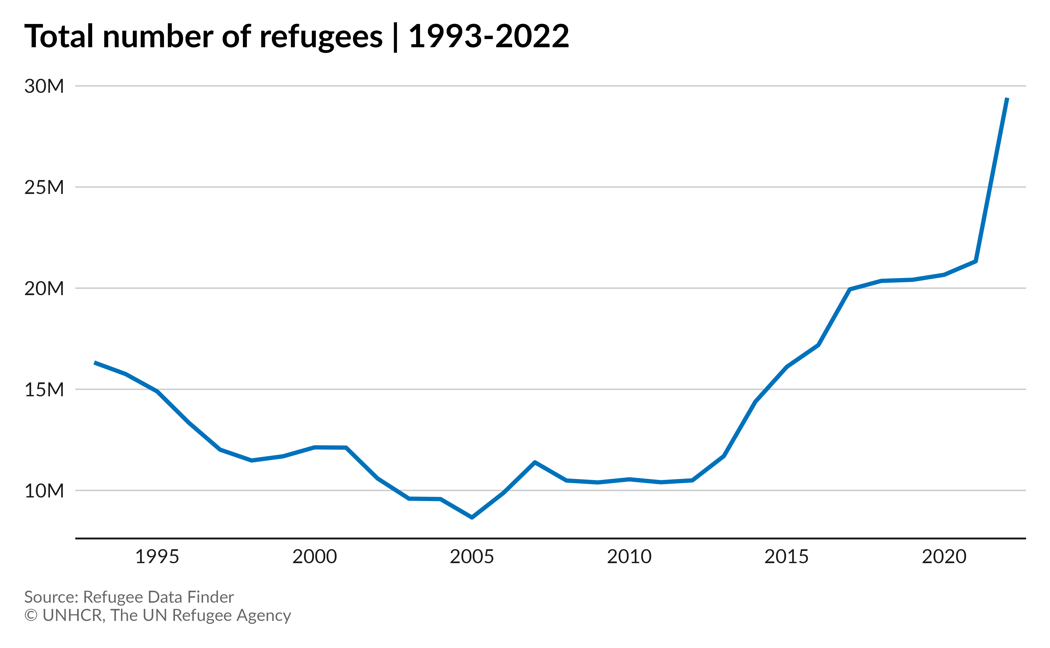
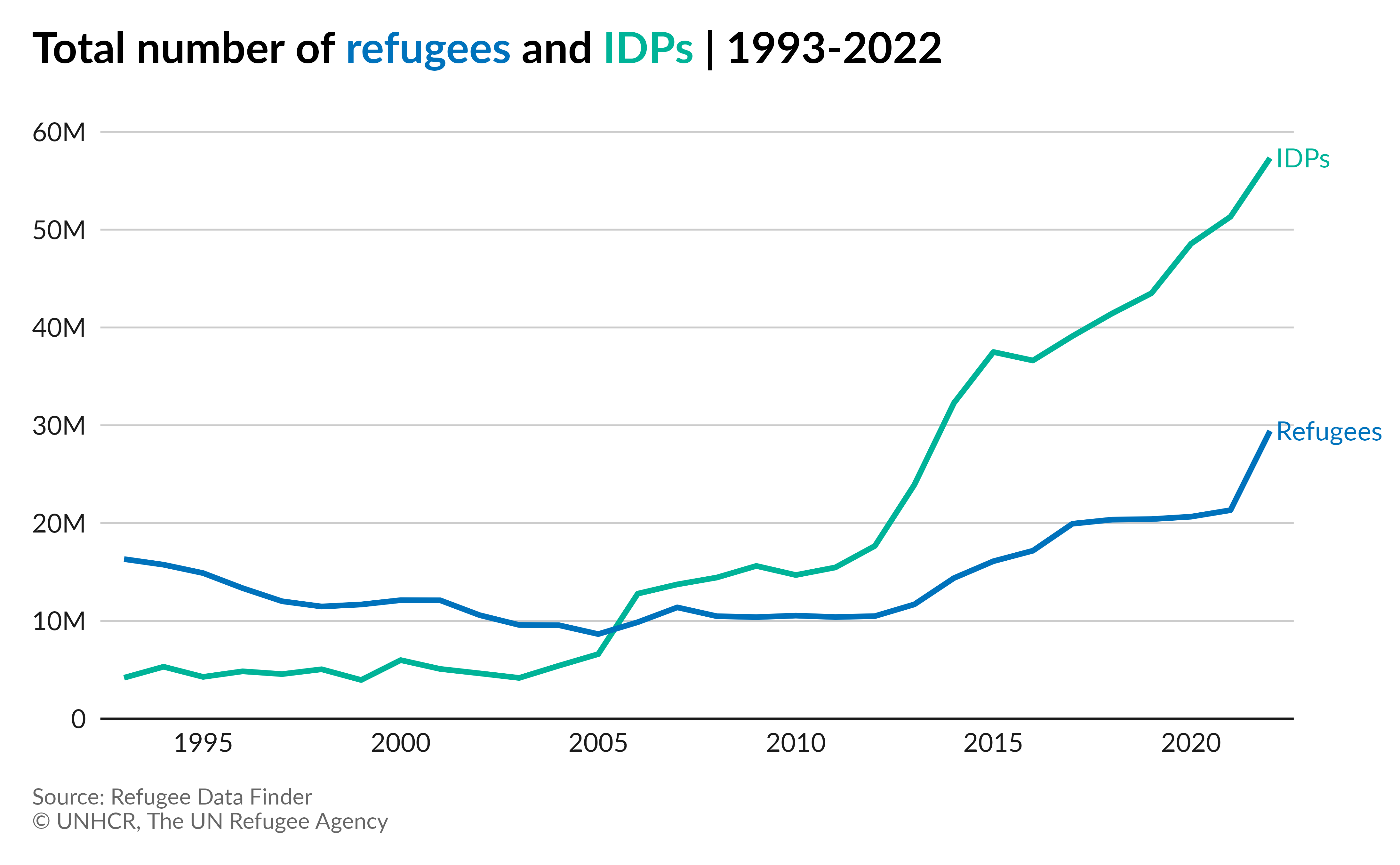
Multiple line chart
Let’s plot the evolution of the total refugee and IDP population from 1993 to 2022.
Preparing the data:
# Keep data from 1993 to 2022, Sum refugees and IDPs by year,
# Pivot longer, year as factor
multi_line_df <- refugees::population |>
  filter(year >= 1993 & year <= 2022) |>
  summarise(
    refugees = sum(refugees, na.rm = TRUE),
    idps = sum(idps, na.rm = TRUE),
    .by = year
  ) |>
  pivot_longer(
    cols = c(refugees, idps),
    names_to = "pop_type",
    values_to = "pop_num"
  ) |>
  mutate(
    year = as_factor(year),
    pop_type = if_else(pop_type == "refugees", "Refugees", "IDPs")
  )
Plot:
# Set title
title_multi_line <- paste0(
  "Total number of <span style='color:",
  unhcr_pal(n = 1, "pal_blue"), "'>",
  "refugees</span> and <span style='color:",
  unhcr_pal(n = 1, "pal_green"), "'>",
  "IDPs</span> | 1993-2022"
)

# Plot
ggplot(
  multi_line_df,
  aes(
    x = year,
    y = pop_num,
    color = pop_type,
    group = pop_type
  )
) +
  geom_line(
    size = 1
  ) +
  scale_x_discrete(
    breaks = scales::pretty_breaks(n = 5)
  ) +
  scale_y_continuous(
    labels = scales::label_number(scale_cut = scales::cut_short_scale()),
    limits = c(0, 6e7), breaks = seq(0, 6e7, by = 1e7),
    expand = expansion(mult = c(0, .05))
  ) +
  scale_color_unhcr_d(
    palette = "pal_unhcr_poc", nmax = 3,
    order = c(3, 1)
  ) +
  labs(
    title = title_multi_line,
    caption = caption
  ) +
  theme_unhcr(grid = "Y", axis = "X", axis_title = FALSE, legend = FALSE)
Plot with labels:
# Plot with labels
# Plot
ggplot(
  multi_line_df,
  aes(
    x = year,
    y = pop_num,
    color = pop_type,
    group = pop_type
  )
) +
  geom_line(
    size = 1
  ) +
  geom_text(
    data = filter(multi_line_df, year == 2022),
    aes(
      label = pop_type
    ),
    hjust = 0,
    nudge_x = 0.15,
  ) +
  scale_x_discrete(
    breaks = scales::pretty_breaks(n = 5)
  ) +
  scale_y_continuous(
    labels = scales::label_number(scale_cut = scales::cut_short_scale()),
    limits = c(0, 6e7), breaks = seq(0, 6e7, by = 1e7),
    expand = expansion(mult = c(0, .05))
  ) +
  scale_color_unhcr_d(
    palette = "pal_unhcr_poc", nmax = 3,
    order = c(3, 1)
  ) +
  labs(
    title = title_multi_line,
    caption = caption
  ) +
  coord_cartesian(clip = "off") +
  theme_unhcr(
    grid = "Y", axis = "X", axis_title = FALSE, legend = FALSE,
    plot_margin = margin(12, 40, 12, 12)
  )
Area chart
Single area chart
Let’s plot the evolution of the total refugee population from 1993 to 2022.
Preparing the data:
# Keep data from 1993 to 2022,
# Sum refugees by year, year as factor
area_df <- refugees::population |>
  filter(year >= 1993 & year <= 2022) |>
  summarise(
    refugees = sum(refugees, na.rm = TRUE),
    .by = year
  ) |>
  mutate(year = as_factor(year))
Plot:
# Set title
title_area <- "Total number of refugees | 1993-2022"

# Plot
ggplot(
  area_df,
  aes(
    x = year,
    y = refugees,
    group = 1
  )
) +
  geom_area(
    fill = unhcr_pal(n = 1, "pal_blue"),
    alpha = 0.3
  ) +
  geom_line(
    color = unhcr_pal(n = 1, "pal_blue"),
    size = 1
  ) +
  scale_x_discrete(
    breaks = scales::pretty_breaks(n = 5)
  ) +
  scale_y_continuous(
    expand = expansion(mult = c(0, .1)),
    labels = scales::label_number(scale_cut = scales::cut_short_scale())
  ) +
  labs(
    title = title_single_line,
    caption = caption
  ) +
  theme_unhcr(grid = "Y", axis = "X", axis_title = FALSE)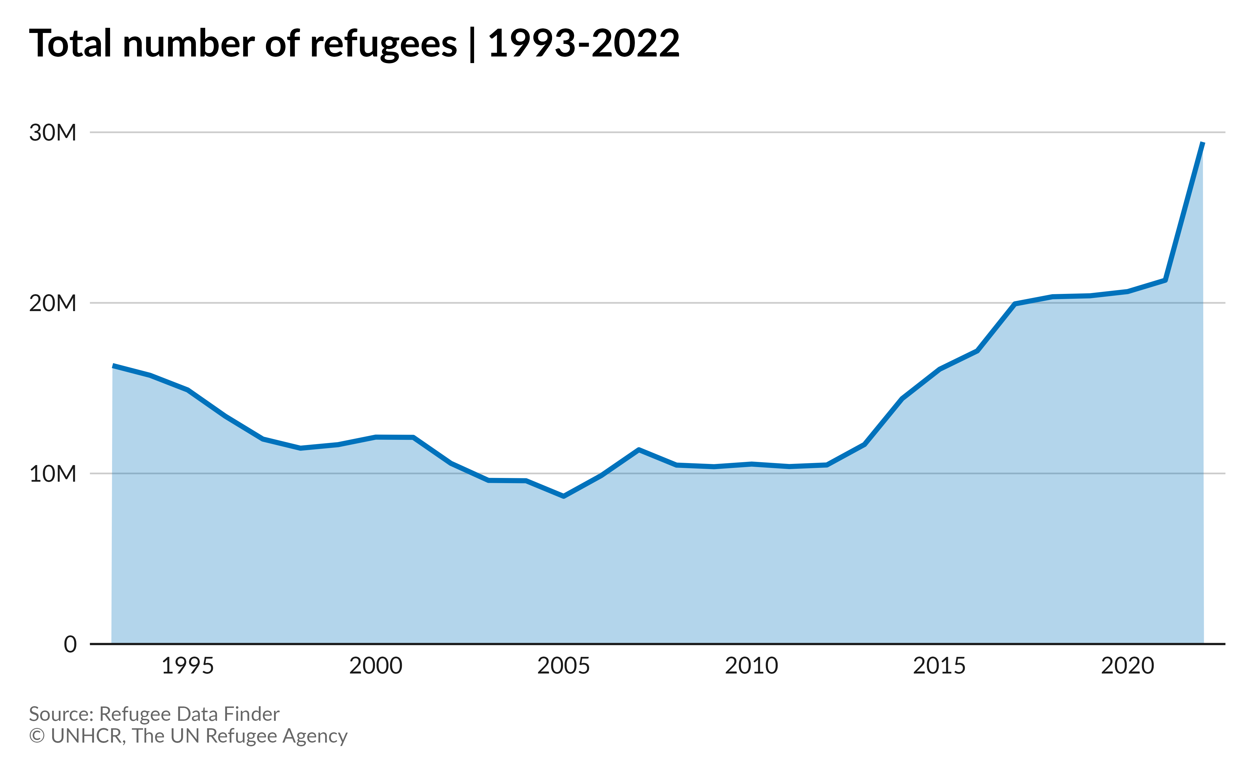
Stacked area chart
Let’s plot the evolution of the total refugee and IDP population from 1993 to 2022.
Preparing the data:
# Keep data from 1993 to 2022, Sum refugees and IDPs by year,
# Pivot longer, year as factor
stack_area_df <- refugees::population |>
  filter(year >= 1993 & year <= 2022) |>
  summarise(
    refugees = sum(refugees, na.rm = TRUE),
    idps = sum(idps, na.rm = TRUE),
    .by = year
  ) |>
  pivot_longer(
    cols = c(refugees, idps),
    names_to = "pop_type",
    values_to = "pop_num"
  ) |>
  mutate(
    year = as_factor(year),
    pop_type = if_else(pop_type == "refugees", "Refugees", "IDPs")
  )
Plot:
# Set title
title_stack_area <- paste0(
  "Total number of <span style='color:",
  unhcr_pal(n = 1, "pal_blue"), "'>",
  "refugees</span> and <span style='color:",
  unhcr_pal(n = 1, "pal_green"), "'>",
  "IDPs</span> | 1993-2022"
)

# Plot
ggplot(
  stack_area_df,
  aes(
    x = year,
    y = pop_num,
    fill = pop_type,
    group = pop_type
  )
) +
  geom_area() +
  scale_x_discrete(
    breaks = scales::pretty_breaks(n = 5)
  ) +
  scale_y_continuous(
    labels = scales::label_number(scale_cut = scales::cut_short_scale()),
    breaks = scales::pretty_breaks(n = 4),
    expand = expansion(mult = c(0, .05))
  ) +
  scale_fill_unhcr_d(
    palette = "pal_unhcr_poc", nmax = 3,
    order = c(3, 1)
  ) +
  labs(
    title = title_stack_area,
    caption = caption,
    y = "Number of people"
  ) +
  theme_unhcr(grid = "Y", axis = "X", axis_title = "y", legend = FALSE)
Pie chart
Let’s plot the percentage of women vs men for all population of concern by the end of 2022.
Preparing the data:
# Filter 2022 records, Keep only relevant pop_type,
# Summarise by gender, pivot longer,
# Calculate percentage
pie_df <- refugees::demographics |>
  filter(year == 2022 &
    pop_type %in% c("REF", "ASY", "IDP", "OIP", "RDP", "RET", "STA", "OOC")) |>
  summarise(
    "Male" = sum(m_total, na.rm = TRUE),
    "Female" = sum(f_total, na.rm = TRUE)
  ) |>
  pivot_longer(
    cols = everything(),
    names_to = "gender"
  ) |>
  mutate(
    percent = value / sum(value)
  )
Plot:
# Set title
pie_title <-
  "Demographics of populations protected and/or assisted by UNHCR at the end of 2022"

# Plot
ggplot(
  pie_df,
  aes(
    x = 1,
    y = percent,
    fill = gender
  )
) +
  geom_col() +
  geom_text(
    aes(
      label = paste0(gender, "\n", scales::label_percent()(percent)),
      y = cumsum(percent) - percent / 2
    ),
    x = 1,
    color = "#ffffff",
    fontface = "bold"
  ) +
  scale_fill_unhcr_d(
    nmax = 4, order = c(4, 1)
  ) +
  coord_polar(
    theta = "y",
    direction = -1
  ) +
  labs(
    title = pie_title,
    caption = caption
  ) +
  theme_unhcr(void = TRUE, legend = FALSE)
Donut Plot:
# Plot
ggplot(
  pie_df,
  aes(
    x = 1,
    y = percent,
    fill = gender
  )
) +
  geom_col() +
  geom_text(
    aes(
      label = paste0(gender, "\n", scales::label_percent()(percent)),
      y = cumsum(percent) - percent / 2,
      color = gender
    ),
    x = 1.8,
    fontface = "bold"
  ) +
  scale_fill_unhcr_d(
    nmax = 4, order = c(4, 1)
  ) +
  scale_color_unhcr_d(
    nmax = 4, order = c(4, 1)
  ) +
  scale_x_continuous(
    expand = expansion(mult = c(0.8, 0.2))
  ) +
  coord_polar(
    theta = "y",
    direction = -1,
    clip = "off"
  ) +
  labs(
    title = pie_title,
    caption = caption
  ) +
  theme_unhcr(void = TRUE, legend = FALSE)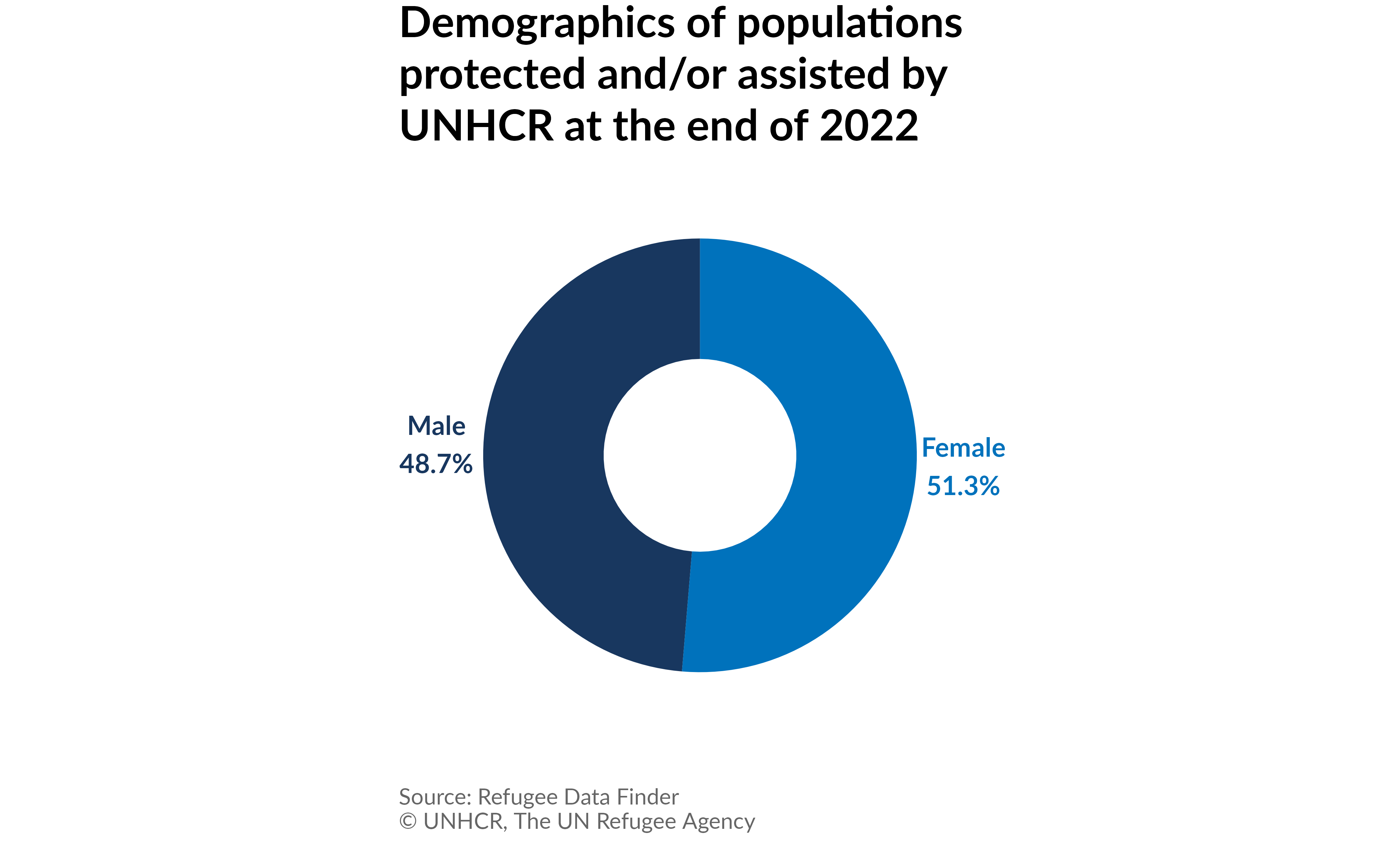
Less common charts
These less common type of charts can be created with the help of the ggplot2 and unhcrthemes packages but will require extra packages. When needed, the code to install the extra packages will be provided.
Treemap
Let’s make a treemap of the refugee population by region of origin in
2022. For this we will use the {treemapify}
package.
Preparing the data:
# Keep 2022 records, Load and join region names,
# Group by region and sum refugees, Remove NAs
treemap_df <- refugees::population |>
  filter(year == 2022) |>
  left_join(refugees::countries, by = c("coo_iso" = "iso_code")) |>
  group_by(unhcr_region) |>
  summarise(refugees = sum(refugees, na.rm = TRUE)) |>
  ungroup() |>
  drop_na(unhcr_region)
Plot:
# Install if needed and load package
# install.packages("treemapify")
library(treemapify)

# Set title
title_treemap <- "Number of refugees by region of origin | 2022"

# Plot
ggplot(
  treemap_df,
  aes(area = refugees)
) +
  treemapify::geom_treemap(
    color = "#FFFFFF",
    size = 1,
    fill = unhcr_pal(n = 1, "pal_blue"),
    start = "topleft"
  ) +
  treemapify::geom_treemap_text(
    aes(label = paste0(
      unhcr_region, "\n",
      scales::label_number(scale_cut = scales::cut_si(unit = ""))(refugees)
    )),
    color = "#FFFFFF",
    size = 9,
    lineheight = 1.1,
    start = "topleft",
    family = "Lato",
    padding.y = unit(2, "mm")
  ) +
  labs(
    title = title_treemap,
    caption = caption
  ) +
  theme_unhcr(void = TRUE)
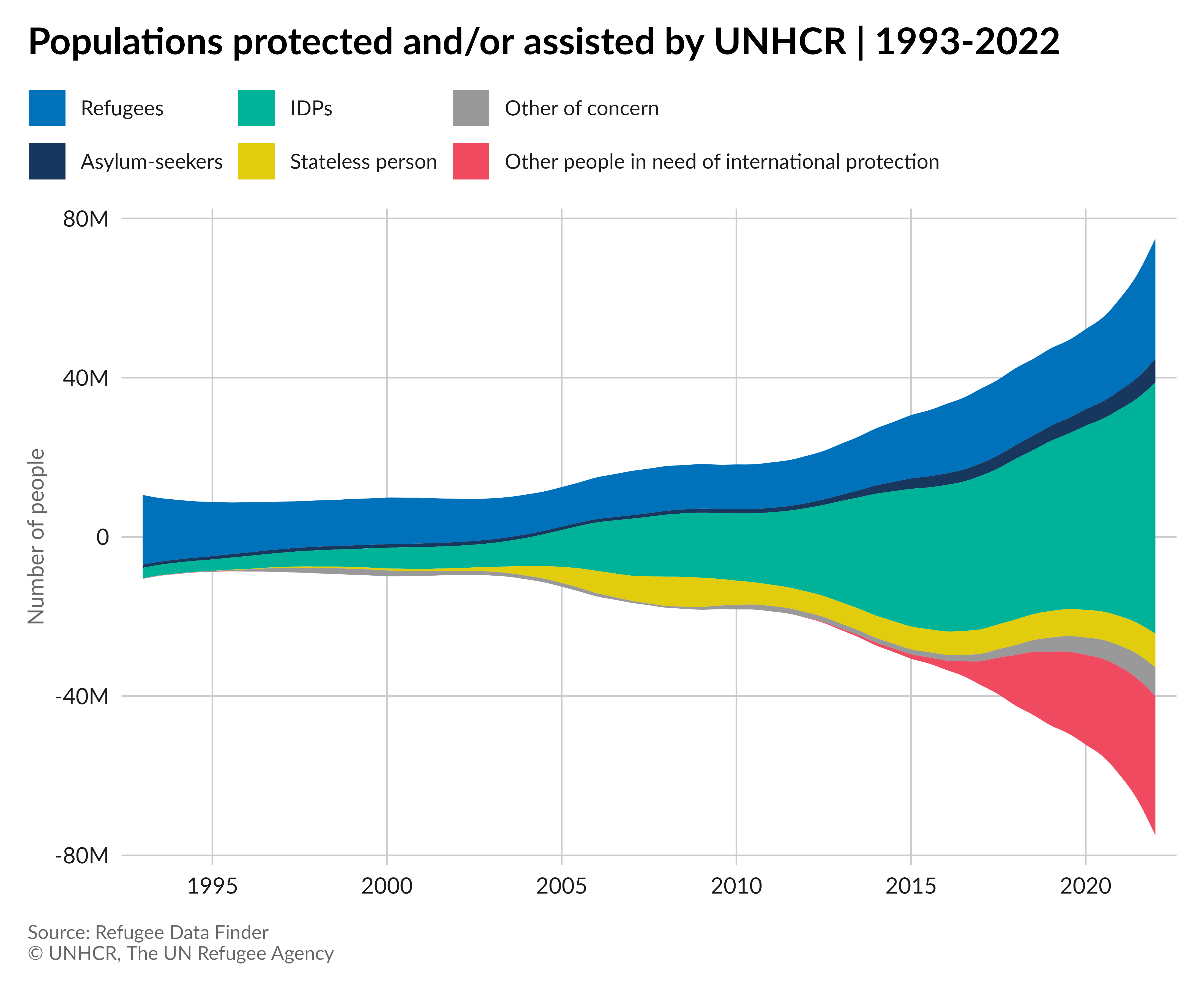
Streamgraph
Let’s make a streamgraph showing the evolution of the populations
assisted by UNHCR from 1993 to 2022. For this we will use the {ggstream}
package.
Preparing the data:
# Keep 1993-2022 records, rename population columns,
# Pivot longer, grou by year and pop_type
# year as factor, pop_type as factor with levels, drop 0s
stream_df <- refugees::population |>
  filter(year >= 1993 & year <= 2022) |>
  select(year,
    "Refugees" = refugees,
    "IDPs" = idps,
    "Asylum-seekers" = asylum_seekers,
    "Stateless person" = stateless,
    "Other of concern" = ooc,
    "Other people in need of international protection" = oip
  ) |>
  pivot_longer(
    cols = c(
      "Refugees",
      "IDPs",
      "Asylum-seekers",
      "Stateless person",
      "Other of concern",
      "Other people in need of international protection"
    ),
    names_to = "pop_type",
    values_to = "pop_num"
  ) |>
  group_by(year, pop_type) |>
  summarise(pop_num = sum(pop_num, na.rm = TRUE)) |>
  ungroup() |>
  mutate(
    year = as_factor(year),
    pop_type = factor(pop_type, levels = c(
      "Refugees",
      "Asylum-seekers",
      "IDPs",
      "Stateless person",
      "Other of concern",
      "Other people in need of international protection"
    ))
  ) |>
  filter(pop_num != 0)
Plot:
# Install if needed and load package
# install.packages("ggstream")
library(ggstream)

# Set title
stream_title <- "Populations protected and/or assisted by UNHCR | 1993-2022"

# Plot
ggplot(
  stream_df,
  aes(
    x = year,
    y = pop_num,
    fill = pop_type,
    group = pop_type
  )
) +
  ggstream::geom_stream() +
  scale_x_discrete(
    breaks = scales::pretty_breaks(n = 5)
  ) +
  scale_fill_unhcr_d(
    palette = "pal_unhcr_poc",
    nmax = 7,
    order = c(1:4, 7, 6)
  ) +
  scale_y_continuous(
    labels = scales::label_number(scale_cut = scales::cut_short_scale()),
  ) +
  labs(
    title = stream_title,
    caption = caption,
    y = "Number of people"
  ) +
  theme_unhcr(
    axis_title = "y",
    legend_text_size = 9
  )
Slope
Let’s create a slope chart showing the evolution of the total refugee population between 2017 and 2022 in the countries from the East and Horn of Africa region.
Preparing the data:
# Keep only 2017 and 2022 records, Load and join region names,
# Keep only countries in East and Horn of Africa region,
# Group by country and year and sum refugees
slope_df <- refugees::population |>
  filter(year == 2017 | year == 2022) |>
  left_join(refugees::countries, by = c("coo_iso" = "iso_code")) |>
  filter(unhcr_region %in% c("East and Horn of Africa")) |>
  group_by(coo_name, year) |>
  summarise(refugees = sum(refugees, na.rm = TRUE)) |>
  ungroup()
Plot:
# Set title
slope_title <- "Evolution of refugee population in East and Horn of Africa region | 2017 vs 2022"

# Plot
ggplot(
  slope_df,
  aes(
    x = year,
    y = refugees,
    group = coo_name
  )
) +
  geom_line(
    color = unhcr_pal(n = 1, "pal_blue")
  ) +
  geom_point(
    color = unhcr_pal(n = 1, "pal_blue"),
    size = 2
  ) +
  ggrepel::geom_text_repel(
    aes(
      label = paste(coo_name, scales::label_number(
        scale_cut = scales::cut_si(unit = ""),
        accuracy = if_else(refugees >= 1e6, .1, 1)
      )(refugees))
    ),
    hjust = if_else(slope_df$year == 2017, 1, 0),
    direction = "y",
    nudge_x = if_else(slope_df$year == 2017, -.3, .3),
  ) +
  scale_x_continuous(
    breaks = c(2017, 2022),
    limits = c(2014, 2025)
  ) +
  labs(
    title = slope_title,
    caption = caption
  ) +
  theme_unhcr(
    axis_title = FALSE, axis_text = "x",
    grid = "X"
  )
We trust that this R package has equipped you with the tools needed to craft visually appealing and on-brand charts with ease. Should you desire further inspiration or in-depth guidance on aligning your data visualizations with UNHCR branding standards, we invite you to explore our UNHCR data visualization platform. There, you will discover a multitude of practical examples showcasing the package’s capabilities in action. Furthermore, you can delve into our comprehensive data visualization guidelines, which offer invaluable insights into UNHCR’s brand recommendations for charts, ensuring that your visualizations harmonize perfectly with the organization’s identity and mission.