Template
The unhcrdown::html_slides template
uses the xaringan
package for creating UNHCR branded HTML presentations
with remark.js through R
Markdown.
To create a UNHCR branded HTML presentation, just create a new R Markdown document with the YAML section, as shown below:
---
title: "Main presentation title"
subtitle: "Subtitle if needed"
author: "Your name"
institute: "Bureau/Divisions"
date: "17 January 2025"
output:
  unhcrdown::html_slides:
    self_contained: true
    nature:
      highlightStyle: github
      highlightLines: true
      countIncrementalSlides: false
      ratio: "16:9"
---
or just open the template provided, if you are using RStudio IDE (see here).
Click the Knit button to compile it and you get the
title slide of your presentation.
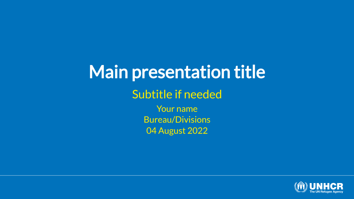
Default title slide:
YAML
Not all the unhcrdown::html_slides YAML arguments are
mandatory. For example, include only the title if
sufficient for your presentation. All the arguments, coming after the
unhcrdown::html_slides call, are part of the
xaringan package. See the help page
?xaringan::moon_reader for all possible configurations. The
template skeleton or above YAML example uses the recommended setup.
Navigate
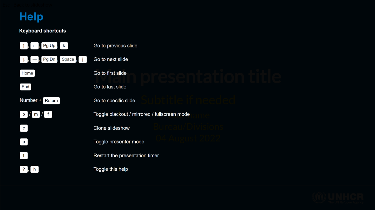
Press h or ? to see the
remark.js keyboard
shortcuts, to help you navigate your presentation.
Navigation shortcuts:
Common presenting workflow, if you have two screens:
- Press c to clone your presentation
- On the presentation screen: Move cloned window here, then press f for full-screen mode
- On the extra screen: Press p for presenter mode. See below on how to add presenter notes
Basic slides
Other than the title slide, the default style is top-left aligned content on a white background. The template includes some helper classes to override the default and create custom slides, such as a section break.
Usage
- Slide content starts immediately after the YAML ends
- Use 3 dashes in a row
---on a line by itself to create a new slide - Use 2 dashes in a row
--for incremental content - Presenter notes can be created using
???
Simple R Markdown example:
---
title: "Main presentation title"
output:unhcrdown::html_slides
---

# Slide one

* First bullet

--

* Second bullet

--

* Third bullet

???
Notes on slide 1

---

# Slide Two

Lorem ispum...
Alignement
Use the following classes to align content within a slide:
-
Horizontal alignment:
left,center,right -
Vertical alignment:
top,middle,bottom
The alignment classes can be applied to the whole slide or to
specific content within a slide. A mix of vertical and horizontal
alignment can be used to affect the position of the entire slide
content. By default, the content is top-left aligned.
Whole slide alignment:
---
class: middle, center

# Middle-center
The horizontal alignment classes can only also be used to move specific content within the overall slide alignment.
Content alignment:
---
class: middle, center

# Middle-center

.left[This text will appear on the **left side** of the slide]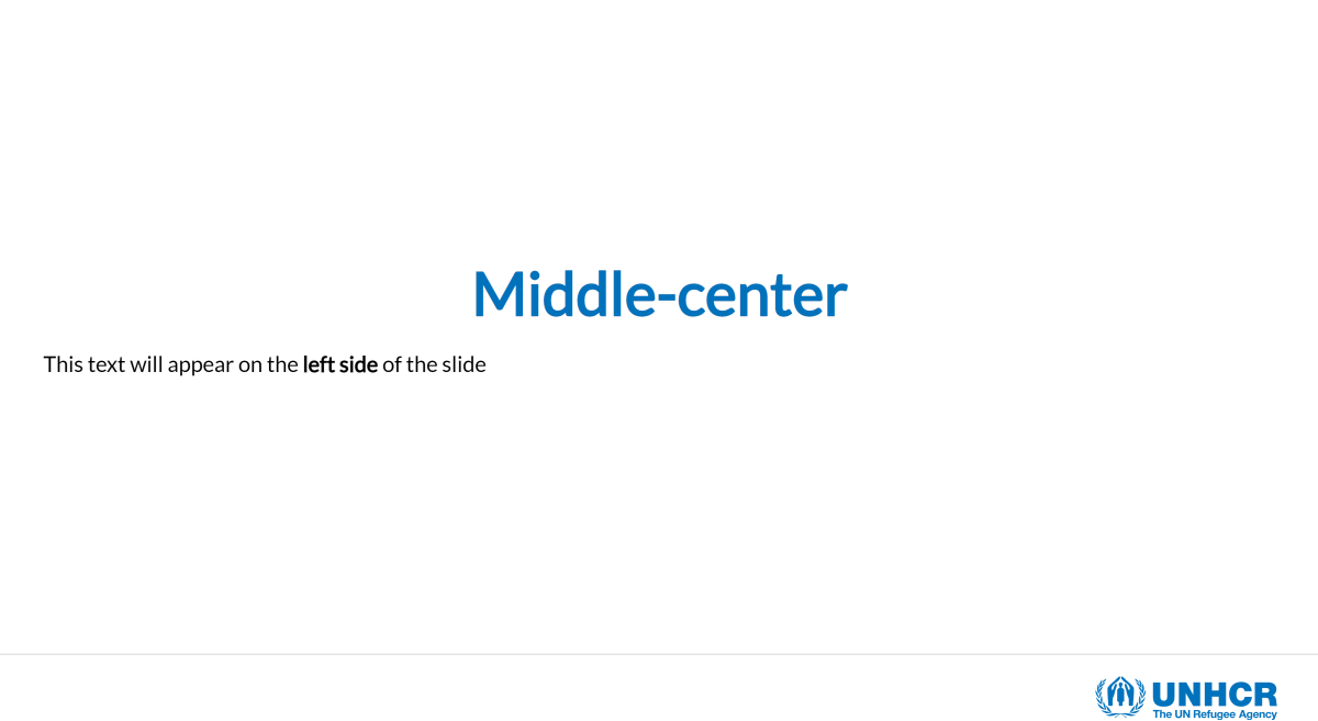
Layout
You can place content to the left or right using the following
classes .pull-left[] and .pull-right[]. This
will create a two-column layout, where each column take up to 47% of the
page width. All the column content needs to go within the respective
[]. You can similarly use .left-column[] and
.right-column[], the sizes are then 20% and 75%.
Basic two columns layout:
# Two columns

Each column takes 47% of the total width

.pull-left[Lorem ipsum...]

.pull-right[Lorem ipsum...]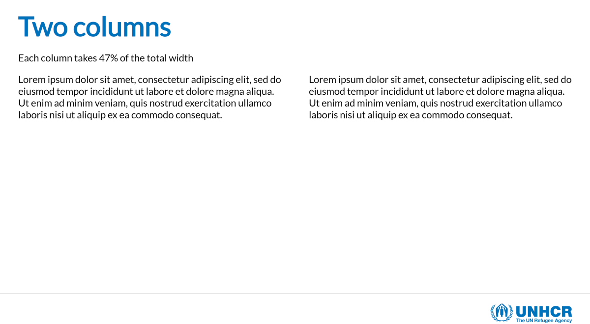
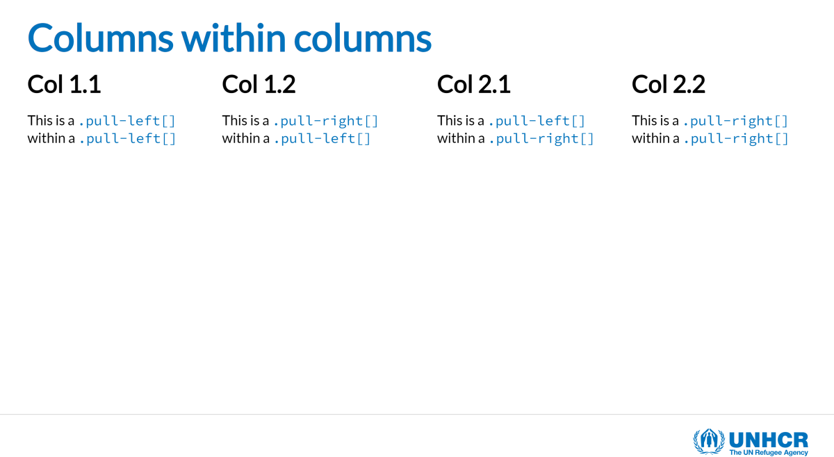
The layout classes are really helpful and can create a complex layout by nesting them:
Advanced layout example:
---
# Columns within columns

.pull-left[
.pull-left[
### Col 1.1
This is a `.pull-left[]` within a `.pull-left[]`
]
.pull-right[
### Col 1.2
This is a `.pull-right[]` within a `.pull-left[]`
]
]

.pull-right[
.pull-left[
### Col 2.1
This is a `.pull-left[]` within a `.pull-right[]`
]
.pull-right[
### Col 2.2
This is a `.pull-right[]` within a `.pull-right[]`
]
]
UNHCR helpers
To further ease the creation of UNHCR branded presentations some specific classes have been added to further stylize the content of a slide. The font family and styles are already set to fit within the brand, but in some cases you might need more flexibility.
Some classes allow to alter the text size, colour and background:
-
Text size:
.large[]and.small[] -
Text colour:
.blue[]and.grey[] -
Text background colour:
.bg-blue[]and.bg-grey[]
Slide example with helper classes:
---
# UNHCR Helpers

You can change the **size** of the text by using the `.large[]` or `.small[]` class

.large[Large text] followed by .small[small text] example

You can change the **colour** of the text by using the `.blue[]` or `.grey[]` class

.blue[Blue text] followed by .grey[grey text] example

You can change the **background** of the text by using the `.bg-blue[]` or `.bg-grey[]` class

.bg-blue[All this text will be in a blue background]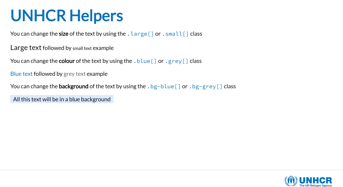
Images and icons
Depending on your needs and control over the image output, you can use the following approaches to include images in your slides:
- Inline R Markdown:
 -
Knitr:
knitr::include_graphics("path_to_image") - Plain HTML:
<img src="path_to_image" width="90%"/>
The brand unit recommends the use of the Humanitarian
icons which are now part of the Fontawesome
set. We recommend the use of the fontawesome
R package. Simply install and load the package to directly access the
whole Fontawesome set:
-
r fa(“hands-holding-circle”, fill = “var(–unhcr-blue)”)=
Background
Colour:
The default slide background is white, but you can apply a branded
UNHCR blue by adding the class inverse to the slide. This
can be useful to create a section break in your presentation. The
inverse class can be coupled with the alignment
classes.
Inverse background example:
---
class: inverse

# Blue background slide
Image:
- You can specify a background image (or multiple images) at the start of your slide just like you did the class for the background colour:
---
background-image: url(path_to_image)
background-size: cover
background-position: center-
Options for
background-sizeinclude:-
coverwill cover the slide so that there is no white space (may cut tops/sides) -
containfits to slide height-wise
-
See here on how you can play around with background position.
Play with the
inverseclass of the slide depending on the logo colour that works better with your picture. If needed, you can remove the logo altogether by putting thehide-logoclass.
Image background example:
---
class: hide-logo
background-image: url(https://raw.githubusercontent.com/unhcr-dataviz/unhcrdown/master/inst/resources/img/cover-example.jpg)
background-size: cover
background-position: center 25%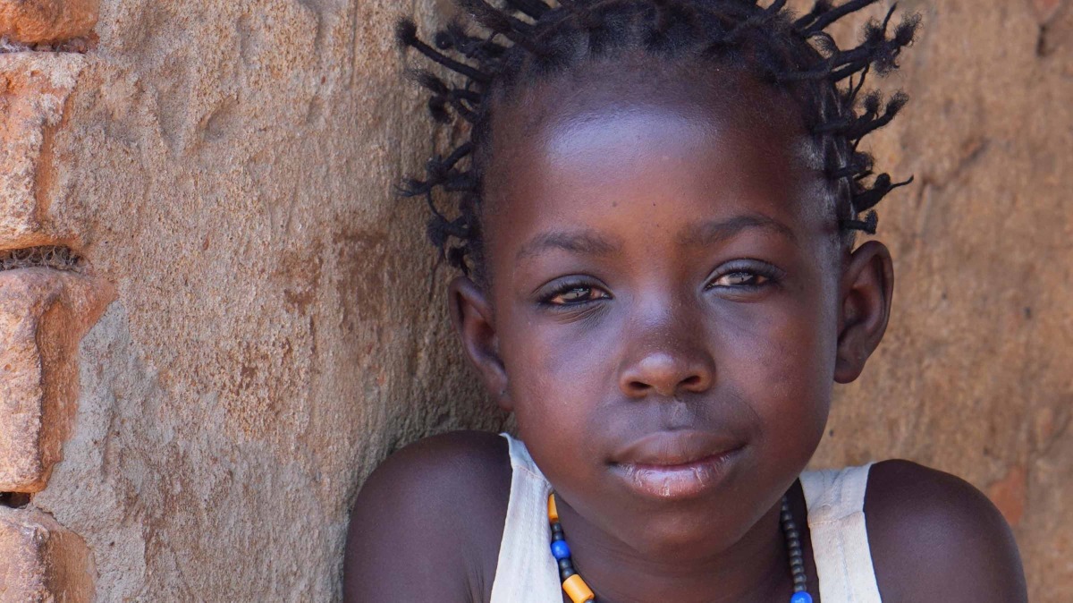
R content
Because unhcrdown::html_slides is an R
Markdown document you can natively include R code chunks as well as
tables and plots.
Highlighting code
If you use the unhcrdown::html_slides
skeleton template or copy the YAML at the top
of the page, the highlighting code option will be turned
on by default. To change this behavior simply edit the
following YAML lines. All the highlight style options can be found here:
nature:
      highlightStyle: github
      highlightLines: true
To highlight lines of code simply add #<< at the
end of each targeted row and a light yellow background will be
added.
Highlighting code:
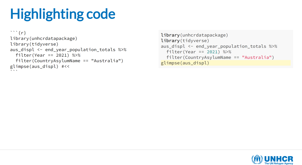
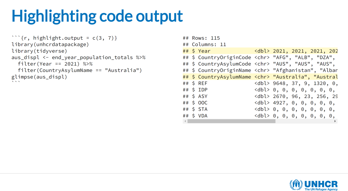
It is also possible to highlight the code output by adding
highlight.output = c(3,4) to the code chunk options.
Highlighting code output:
Tables
You can display a table directly in an R chunk, but for a simple
table we recommend the use of kable from the
knitr package. To ensure the proper representation of the
table, make sure to add the format HTML to your kable call:
knitr::kable(format = "html"). You can also set this as a
global option for all your slides using
options(knitr.table.format = "html").
The kable function can also help format the output
format, like formatting numbers, changing column names or adding a
caption. You can see more information on kable and what it
can do here.
Simple kable table:
head(aus_displ) |>
  knitr::kable(format = "html",
               col.names = c("Country of origin", "Country of asylum",
                            "Population type", "Number of people"),
               caption = "Displaced population in Australia | 2021")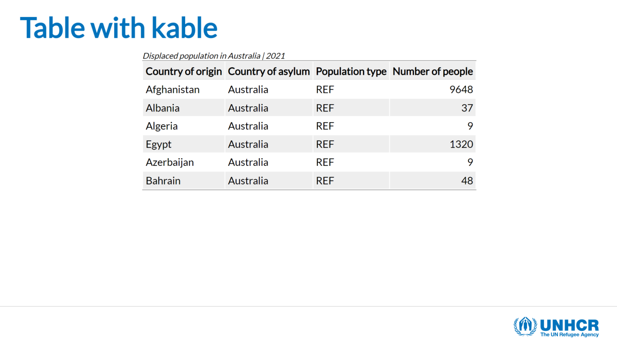
For more flexibility and advanced table style refer to other R
packages like GT for
static tables or DT if you need
some interactivity.
UNHCR table classes
For simple tables, we included a series of classes
that can be applied to the kable output format. Simply add
the required class names to the table.attr parameter of the
kable call, don’t forget to use \ to escape
the quote character.
The following classes are available:
-
.table: initiate the possibility to stylize the table and provide base style. This class is mandatory. -
.table-blue: add light blue background for alternate rows. -
.table-grey: add light grey background for alternate rows. -
.table-narrow: when.tableis set, the width is 100%..table-narrowallows to fit the width to the content. -
.table-noborder: remove all borders from the table.
Kable table with UNHCR classes:
head(aus_displ) |>
  knitr::kable(format = "html",
               col.names = c("Country of origin", "Country of asylum", "Population type", "Number of people"),
               caption = "Displaced population in Australia | 2021",
               table.attr = "class=\"table  table-blue table-narrow table-noborder\"")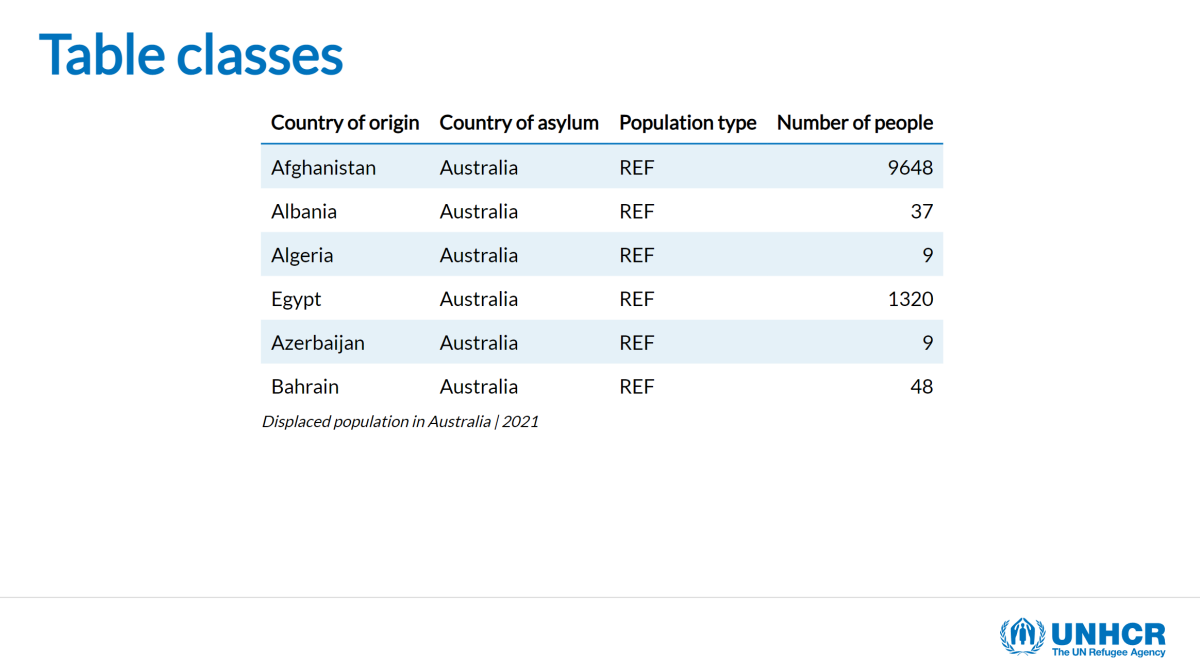
Plots
For the creation of charts, we recommend the use of the unhcrthemes
as it provides a ggplot2 theme and a set of colour palettes
for making charts and graphics based on the UNHCR Data Visualization
Guidelines. The charts made with unhcrthemes
will be perfectly integrated in the unhcrdown::html_slides
presentation and will be fully aligned with the UNHCR brand.
Inserting a plot is as easy as a table and only requires a few lines
of code. For more information on how to make a plot using
unhcrthemes please refer to package
documentation and the UNHCR Data Visualization
Platform R tutorials.
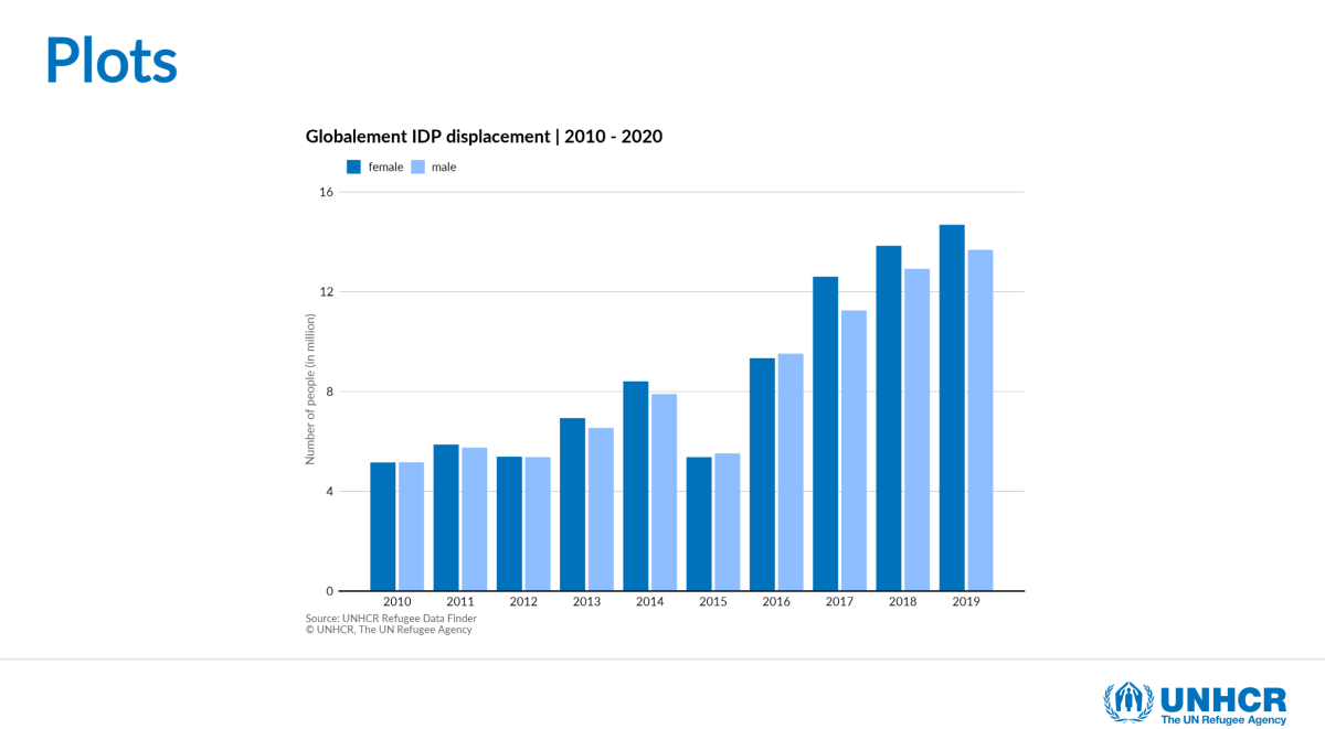
unhcrthemes plot example:
```{r, fig.showtext = TRUE, fig.retina = 4, out.width="60%", fig.height=5}
library(tidyverse)
library(scales)
library(unhcrthemes)

idp_total_sex <- idp |>
  group_by(year, sex) |>
  summarise(idp = sum(idp, na.rm = TRUE) / 1e6) |>
  ungroup()

ggplot(idp_total_sex) +
  geom_col(aes(x = year, y = idp, fill = sex),
    width = 0.8,
    position = position_dodge(width = 0.9)
  ) +
  scale_fill_unhcr_d(palette = "pal_unhcr") +
  scale_y_continuous(expand = expansion(c(0, 0.1))) +
  labs(
    title = "Globalement IDP displacement | 2010 - 2020",
    y = "Number of people (in million)",
    caption = "Source: UNHCR Refugee Data Finder\n© UNHCR, The UN Refugee Agency"
  ) +
  scale_x_continuous(breaks = pretty_breaks(10)) +
  theme_unhcr(grid = "Y", axis_title = "y")
```
Getting your plot right is not always easy, but you can control your
plots by playing with individual chunk options like
fig.retina and out.width (plus
fig.width and fig.height). Often this requires
some trial and error, but check Hadley/Garrett’s recommended ggplot2
chunk options for guidance.
Show code alongside resulting plot:
A nice tip for the purpose of teaching is to use the
fig.show and the ref.label code chunk options
to avoid repeating your code.
- Chunk showing code:
{r plot-name, fig.show = 'hide'} - Chunk showing plot:
{r ref.label = 'plot-name', echo = FALSE}

Scrolling R output
We would recommend making sure your content fits the height of the slide but sometimes R output can be extensive. For this scenario, we included some custom classes depending on how many lines you want to show, just wrap the targeted content in the desired class:
-
.scroll-box-8[]: show 8 lines -
.scroll-box-10[]: show 10 lines -
.scroll-box-12[]: show 12 lines -
.scroll-box-14[]: show 14 lines -
.scroll-box-16[]: show 16 lines -
.scroll-box-18[]: show 18 lines -
.scroll-box-20[]: show 20 lines
Thanks to Garth Tarr from the University of Sydney for the idea.